
Browse by category
- Adaptive reuse
- Archaeology
- Arts and creativity
- Black heritage
- Buildings and architecture
- Communication
- Community
- Cultural landscapes
- Cultural objects
- Design
- Economics of heritage
- Environment
- Expanding the narrative
- Food
- Francophone heritage
- Indigenous heritage
- Intangible heritage
- Medical heritage
- Military heritage
- MyOntario
- Natural heritage
- Sport heritage
- Tools for conservation
- Women's heritage

- Home
- Adaptive reuse
- Archaeology
- Arts and creativity
- Black heritage
- Buildings and architecture
- Communication
- Community
- Cultural landscapes
- Cultural objects
- Design
- Economics of heritage
- Environment
- Expanding the narrative
Expanding the narrative
This is part of a broader conversation about whose history is being told, about gender, people of colour and the economically disenfranchised, and others whose stories have been overlooked or intentionally omitted from the authorized discussion.
- Food
- Francophone heritage
- Indigenous heritage
- Intangible heritage
Intangible heritage
Intangible cultural heritage includes language, traditions, music, food, special skills, etc.
- Medical heritage
- Military heritage
- MyOntario
- Natural heritage
- Sport heritage
- Tools for conservation
- Women's heritage
In praise of older windows
Buildings and architecture
Published Date: Nov 15, 2007
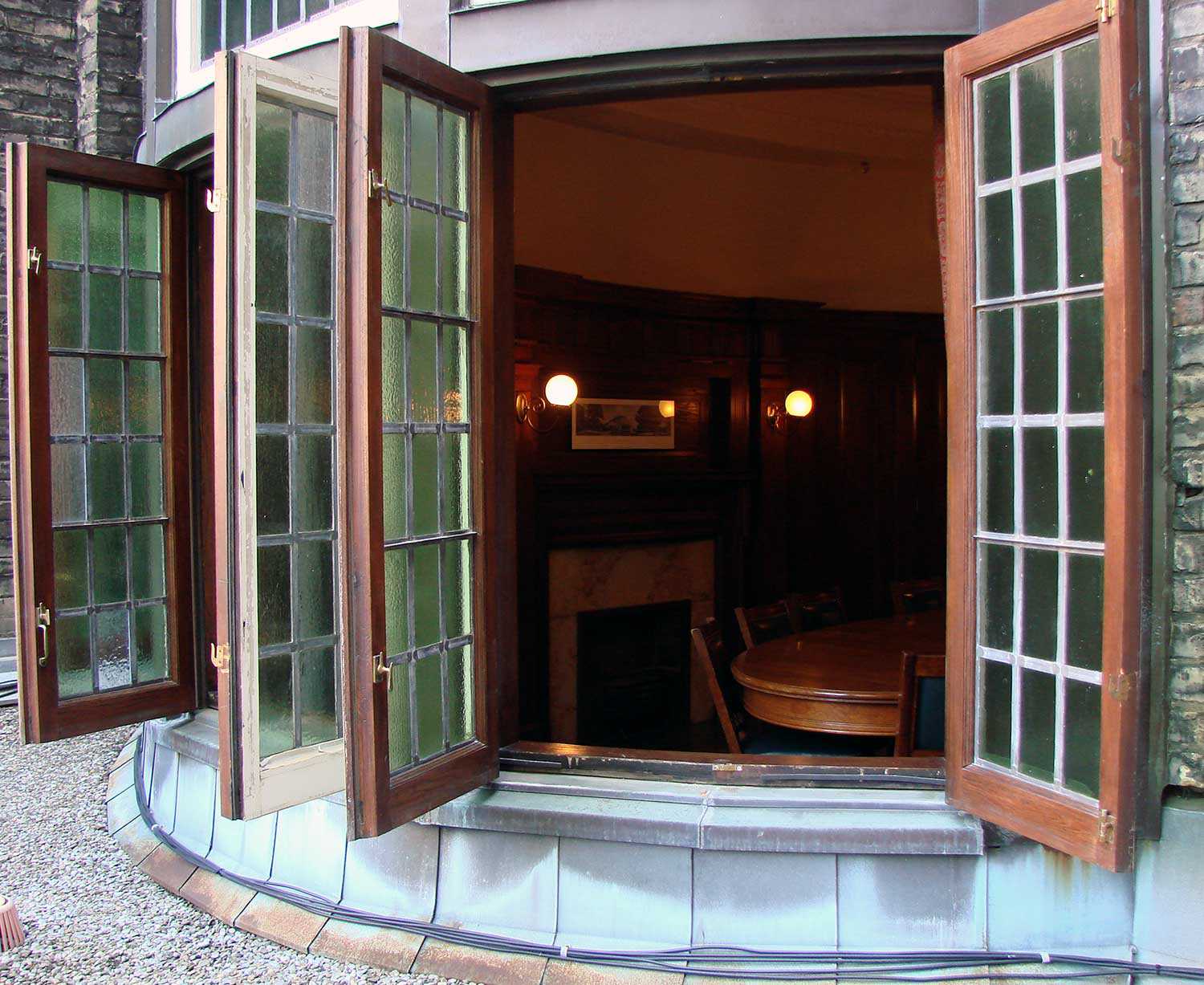
Photo: Casement windows of the Oval Boardroom
Façade: a word of double-edged meaning. Architecturally, it refers to the face of a building. In literature, more often than not, it connotes a front of showy misrepresentation intended to conceal something unpleasant.
The Ontario Heritage Trust is in the midst of restoring a façade – that of its Toronto headquarters, the Ontario Heritage Centre. This façade has a restrained Edwardian character punctuated by bursts of Beaux Arts-spirited ornamental swags, wreaths and figural carving. It is made of industrially produced cast stone but has hand-carved sandstone embellishments. Portions of the cast stone have deteriorated beyond the reach of conservation and are being replaced with new like material. The rest is being repaired and cleaned. But how much to clean? What constitutes patina and should it be retained? How uniform must old and new look? The Trust is taking a cautious approach to gently preserve the face of this building so that it comfortably takes its place on Adelaide Street, as one of a few older citizens in a neighbourhood increasingly populated by new arrivals.
The Ontario Heritage Centre was designed by architect George Gouinlock, built in 1908 for the Birkbeck Saving and Investments Company. The façade was the dignified face of company headquarters – a best foot forward to what was essentially a speculative office building of typical quality. This face stylishly represents the building behind it, but also reveals something about the way the building was intended to function.
Windows are where style and function come together. The façade contains a great variety of windows – circular and large arched windows with glazing subdivided by elegantly thin mullions, operable single-hung sash windows and two giant semi-circular windows at the second floor, each swinging open on its central pivot. The windows of the other sides of the building are all operable as well. If we look at the façade, and then through its windows into the building, an intrinsic characteristic is revealed: this building was designed to function with natural light and natural ventilation. The modern mechanical systems installed in 1989 were designed to complement the function of these earlier ventilation devices.
Elevators were commonplace in 1908. Electricity was available but privately controlled and unreliable. Ceiling fans provided limited mechanical ventilation. Air conditioning would only become available in 1915 and the chiller that provided cooling for large occupied spaces was not introduced until the mid-1920s.
Between about 1880 and 1915, multi-storey commercial buildings made possible by elevators still relied primarily on natural ventilation and light. Buildings were designed to respond to climate and site in a way that made them work with the elements rather than against them – a common-sense and unselfconsciously green approach to environmental control.
The Birkbeck Building has graduated ceiling heights. The ground floor, where the light condition is least adequate, has 20-foot ceilings with very tall windows and a mezzanine to maximize day-lit office space. The second floor is 13 feet high, to accommodate large windows in rooms associated with prime, walk-up tenant space. The typical upper floors have 11-foot ceilings, sufficient to light small repetitive offices while reducing the stairs to be climbed.
In plan, the Birkbeck Building is open on three sides. Ancillary spaces – such as stairs, washrooms and vaults – are relegated to the darkest portion of the floor plate against a blank party wall. The average depth of an office is about 24 feet, which is the depth that daylight will penetrate. There is a slightly indented light court facing west to catch light when it is most valuable and difficult to obtain – the late afternoon. Sash windows admit light into the perimeter office spaces and the general office area beyond. These private office areas are separated from the public corridor by wood partitions with large frosted glass panels that still allow light to filter through to the internal corridor.
A similar set of passive devices regulates ventilation. The corridor has operable windows at either end to provide cross-ventilation – creating, in effect, a large central cooling duct. Internal doors incorporate a variety of transom panels, each with their own system of manual controls that, like baffles, can be adjusted to control and channel cross-circulation of air. They come in a variety of sizes and are devices that are full of utility, but also of delight.
The façade of the Birkbeck Building conceals something that is practical, but by no means unpleasant – a building that takes full advantage of natural light and ventilation. At a time when new buildings are being designed with an eye to sustainable levels of energy consumption, the Birkbeck Building – and others like it – provide enlightened examples of how it can be done.
RelatedStories
- 01 Oct 2019
- Economics of heritage
Buildings and architecture
Community
Adaptive reuse - Author: David Leonard,
How Doors Open Ontario activates the province’s communities
The Ontario Heritage Trust’s Doors Open Ontario program works with communities and partners to open the doors, gates and courtyards of Ontario’s most unique and...

- 01 Oct 2019
- Economics of heritage
Buildings and architecture
Adaptive reuse - Author: Romas Bubelis,
The case for craftsmanship
One of the greater pleasures of working in architectural conservation in Ontario is the opportunity it provides to work with traditional building materials: the timber...

- 01 Oct 2019
- Economics of heritage
Buildings and architecture
Arts and creativity
Community
Adaptive reuse - Author: Christina Jennings,
Quiet on the set
Shaftesbury is the company behind the hit television series Murdoch Mysteries and Frankie Drake Mysteries, both of which air on CBC in Canada and are...

- 01 Oct 2019
- Economics of heritage
Buildings and architecture
Community
Adaptive reuse - Author: Emily Sajdak,
The economic halo effect of sacred places: Measuring civic impact in an innovative new way
Nestled in the old city of Philadelphia, Pennsylvania, Old St. George’s United Methodist Church is a “mother church” of the denomination and the oldest Methodist...
- 01 Oct 2019
- Economics of heritage
Buildings and architecture
Community
Adaptive reuse - Author: Erin Semande,
Case study: Brockville Railway Tunnel
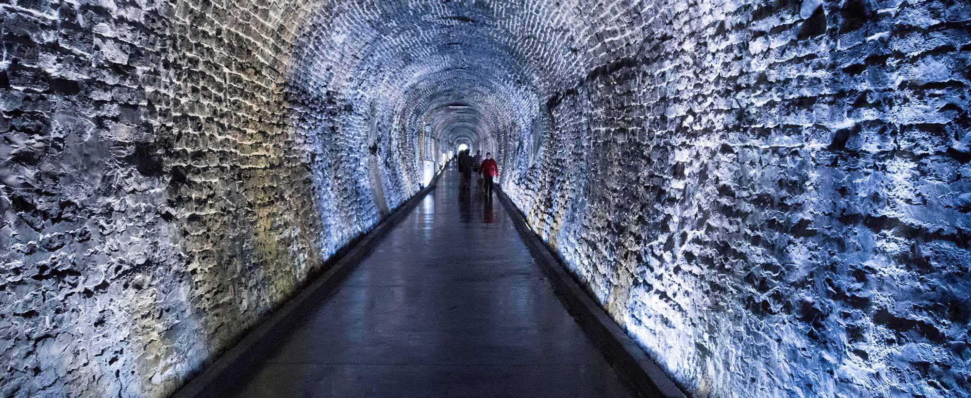
Location: 1 Block House Island Road, BrockvilleOwner: City of BrockvillePartners: Brockville Railway Tunnel Committee (plus countless generous donors)Original use: Canada’s first railway tunnel and part...
- 01 Oct 2019
- Economics of heritage
Buildings and architecture
Community
Food
Adaptive reuse - Author: Erin Semande,
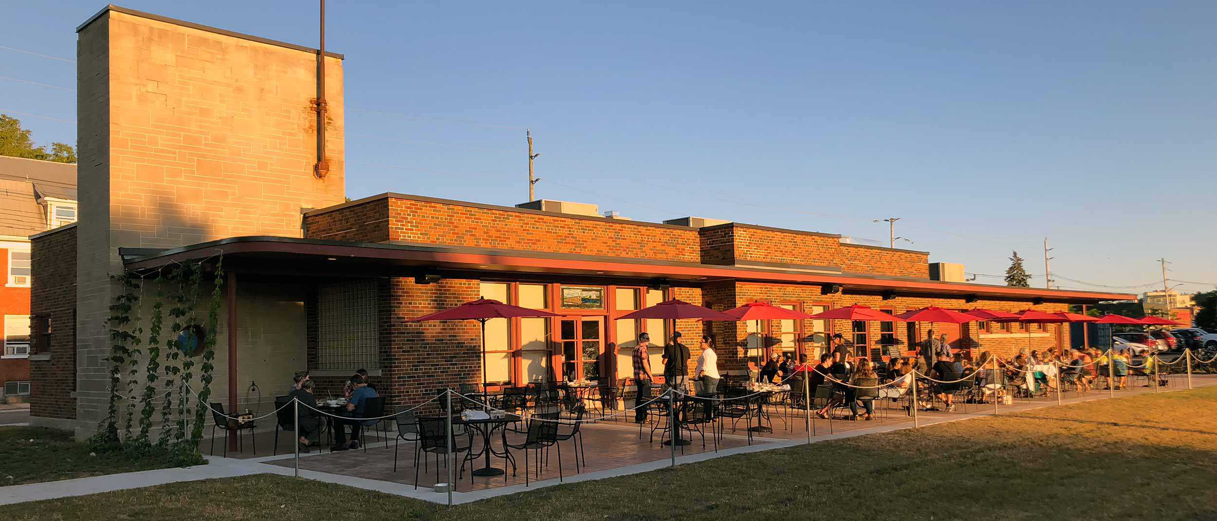
Case study: Mudtown Station Brewery and Restaurant (Owen Sound)
Location: 1198 1st Avenue East, Owen SoundOwner: City of Owen SoundPartners: Kloeze Family (Mudtown Station Inc.)Original use: Passenger train station (Owen Sound Canadian Pacific Railway...
- 01 Oct 2019
- Economics of heritage
Buildings and architecture
Community
Adaptive reuse - Author: John Coleman,
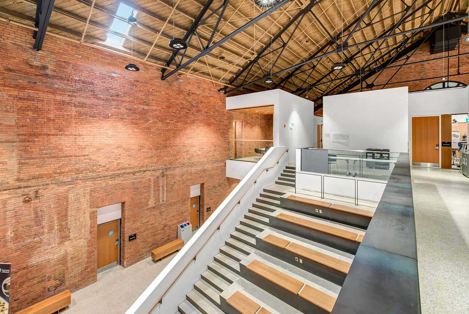
Learning from the past
Heritage has always been at the heart of the University of Windsor’s ambitious plan to preserve the century-old Windsor Armouries and transform the building into...

- 01 Oct 2019
- Economics of heritage
Buildings and architecture
Adaptive reuse - Author: Michael Emory,
Heritage buildings and the evolution of workspace
I work for Allied Properties – a leading owner, manager and developer of urban workspace in major Canadian cities. Allied’s units are publicly traded on...

- 01 Oct 2019
- Economics of heritage
Buildings and architecture
Community
Adaptive reuse - Author: Kiki Aravopoulos,
Case study: Thunder Bay District Courthouse
Location: 277 Camelot Street, Thunder BayOwner: David Sun, Business owner/InvestorPartners: Ascend HotelsOriginal use: CourthouseCurrent use: Hotel The former Thunder Bay District Courthouse sits perched atop...

- 01 Oct 2019
- Economics of heritage
Buildings and architecture
Community
Adaptive reuse - Author: Jennifer Campbell,
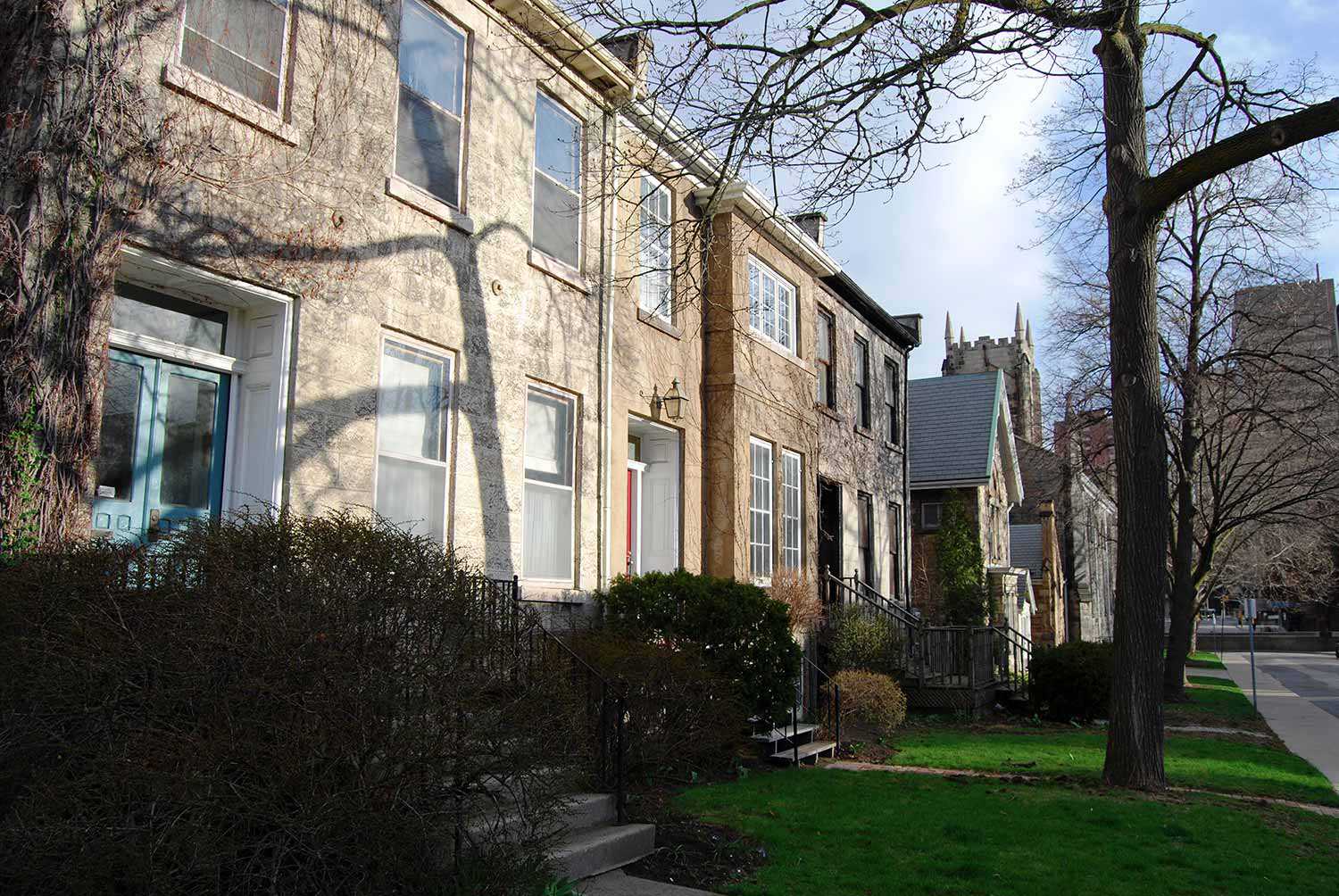
Heritage builds vibrant communities and cultural economies in Kingston
In 2010, the City of Kingston released its first Culture Plan – a document that shared a sustainable, authentic, longterm vision for cultural vitality in...
- 01 Oct 2019
- Economics of heritage
Buildings and architecture
Community
Adaptive reuse - Author: Paul Shaker,
The economic value of heritage districts: How assessment growth in heritage conservation districts compares with non-designated areas in Hamilton
There are competing views about the value of heritage properties. On the one hand, there is a growing consensus on the esthetic and economic development...

- 01 Oct 2019
- Economics of heritage
Buildings and architecture
Environment
Community
Adaptive reuse - Author: Clare Ronan,
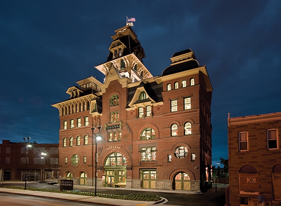
Reside: When heritage preservation translates to affordable housing
Raising the Roof is a Canadian charity that provides national leadership in homelessness prevention through various initiatives. Reside is one such project that creates affordable...
- 01 Oct 2019
- Economics of heritage
Buildings and architecture
Community
Adaptive reuse - Author: Thompson M. Mayes,
Old places support a sound, sustainable and vibrant economy
In Why Old Places Matter, I wrote about the many reasons that old places help people flourish. Yet, I intentionally saved the discussion of how...

- 01 Oct 2019
- Economics of heritage
Buildings and architecture
Community
Adaptive reuse - Author: Beth Hanna,
Revitalizing communities – The power of conservation
Over the past few years, I’ve spoken and written extensively about value – exploring questions of what we protect, how we make those decisions, and...
- 17 Feb 2017
- Buildings and architecture
MyOntario - Author: Kevin Mannara,
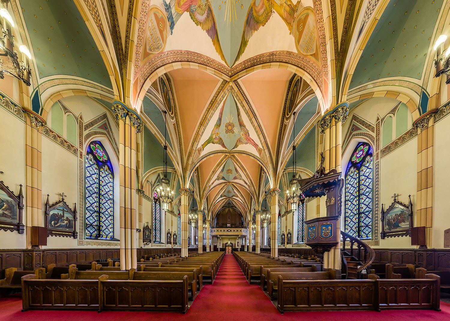
What was and what will be
The term symbolkirchen can roughly be translated as a “symbol bearing church.” Such churches point to living realities beyond ourselves and hold the potential to...

- 17 Feb 2017
- Buildings and architecture
MyOntario - Author: Georges Quirion,
Ontario’s rich industrial history
Northern Ontario has unique structures, not familiar to many, spread out through small northern communities, reflecting its rich history and its vast wealth of precious...

- 17 Feb 2017
- Indigenous heritage
Buildings and architecture
MyOntario - Author: R. Donald Maracle,
Christ Church, Her Majesty’s Chapel Royal of the Mohawk – Tyendinaga Mohawk Territory
During the American Revolution, the Mohawks were forced to flee their homeland in upper New York State. In 1784, after spending several years in Lachine...
- 05 Dec 2014
- Buildings and architecture
Community - Author: Valerie Verity,
A story of two families
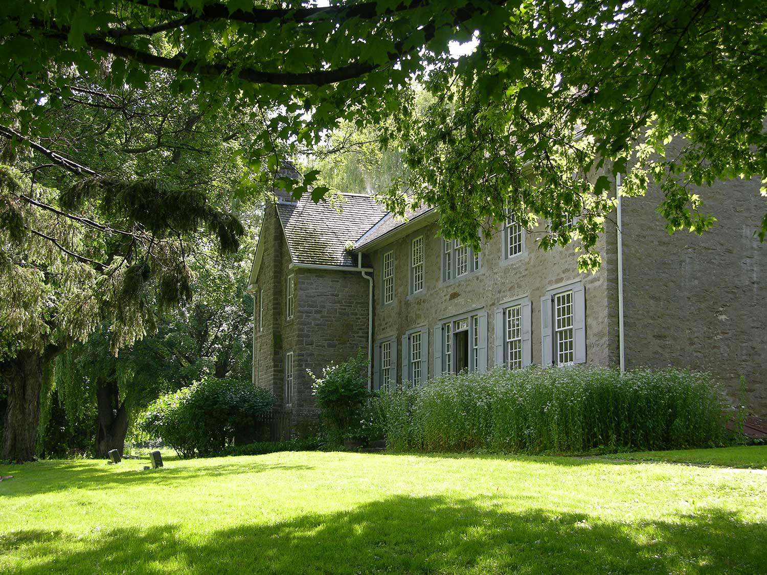
What a story the Macdonell-Williamson House and property can tell! Its location – with a commanding view overlooking the Ottawa River (where goods and people...

- 05 Dec 2014
- Archaeology
Buildings and architecture - Author: Dena Doroszenko and Romas Bubelis,
Perspectives on a site: Artifacts, fragments and layers
When the Trust conserves a property as complex as Macdonell-Williamson House, we consider a variety of perspectives related to the site as an artifact –...

- 05 Dec 2014
- Buildings and architecture
Cultural objects - Author: Sam Wesley,
Understanding Macdonell-Williamson House through four artifacts
It is tempting, while admiring Macdonell-Williamson House’s centuries-old stone walls, Palladian grandeur and picturesque setting, to conjure up an era defined by continuity – when...
- 05 Dec 2014
- Buildings and architecture
- Author: Michael Csiki, Majula Koita and Chantel Godin,
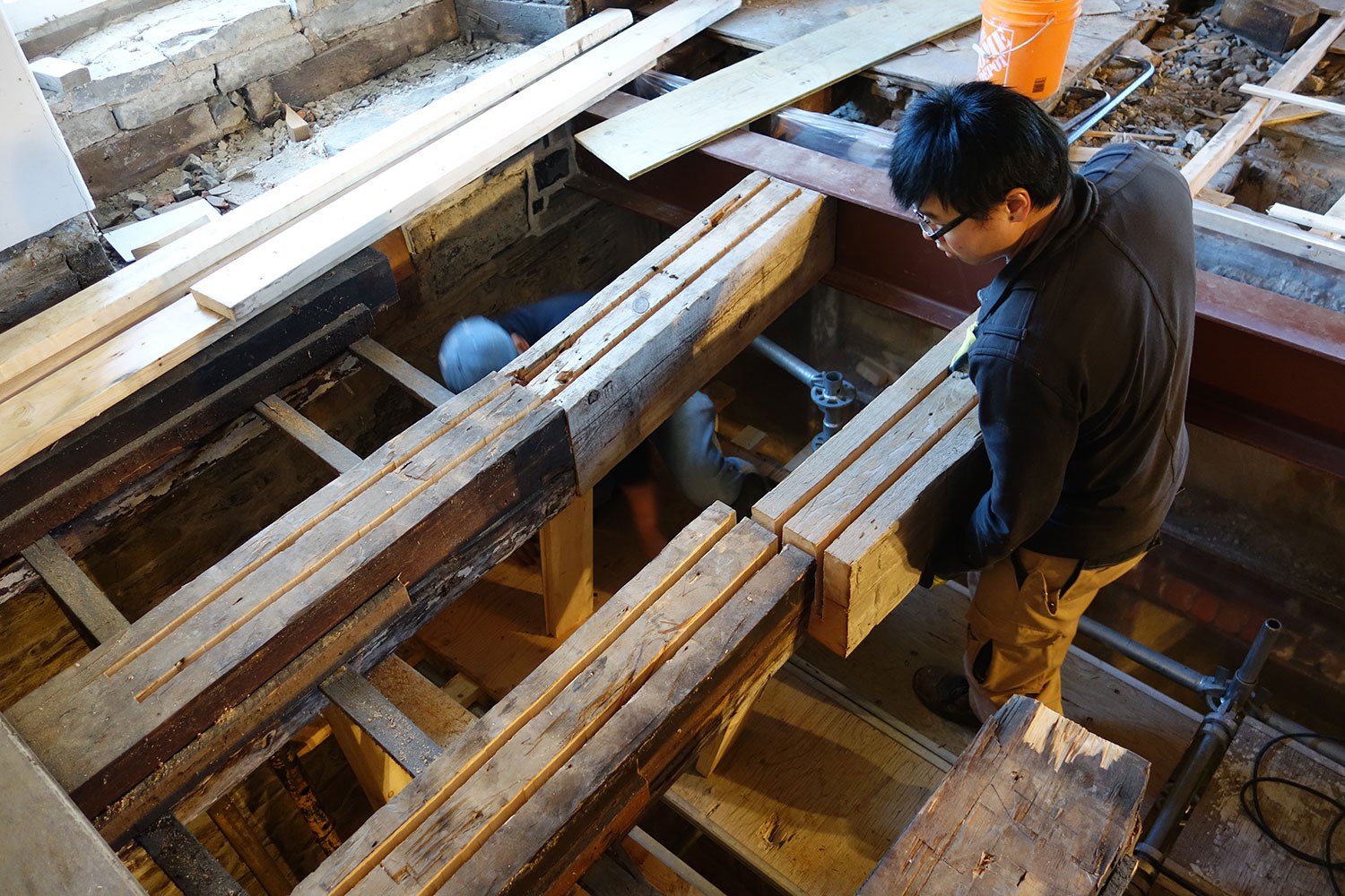
Engineering a solution: A structural perspective of Macdonell-Williamson House
The structural rehabilitation of Macdonell-Williamson House has provided a great opportunity for the engineers at Quinn Dressel Associates to contribute to the preservation of a...

- 14 Feb 2014
- Buildings and architecture
Arts and creativity
Adaptive reuse - Author: Janet Gates,
One hundred years of entertainment
Birthdays are about celebration and, in the case of Toronto’s Elgin and Winter Garden theatres, a toast to 100 years of entertainment history. In 2013...
- 06 Sep 2013
- Buildings and architecture
Arts and creativity - Author: Erin Semande,
Partnering for conservation
The Ontario Heritage Trust has a number of conservation tools available to protect and preserve heritage throughout the province. Conservation easements are voluntary legal agreements...

- 06 Sep 2013
- Buildings and architecture
Arts and creativity
Adaptive reuse - Author: Thomas Wicks,
Treading the boards
Performance venues command an important presence in Ontario communities. They tell us about the aspirations of the people who built them, and they reflect the...

- 06 Sep 2013
- Buildings and architecture
Arts and creativity
Adaptive reuse - Author: Pamela Cain,
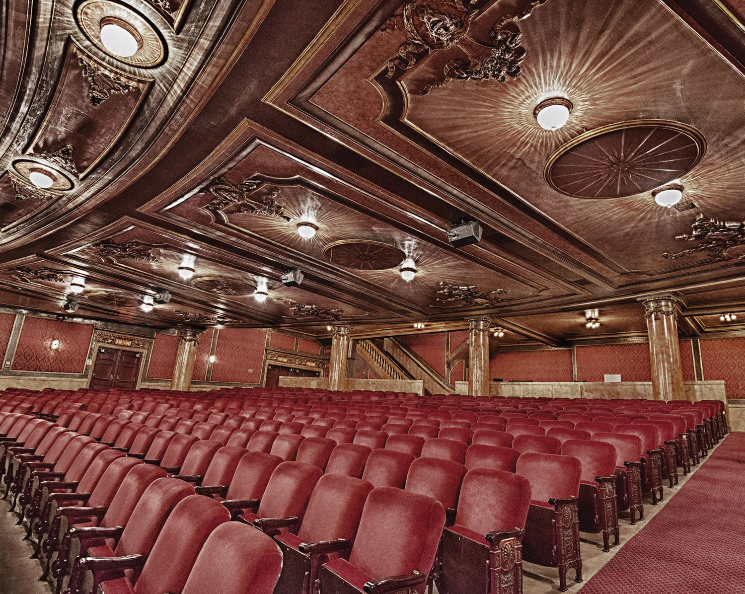
Second run: A new life for an Ontario theatre
Since the early 1970s, Magnus Theatre in Thunder Bay has made a commitment to urban renewal and the reuse and repurposing of community buildings. The...
- 06 Sep 2013
- Buildings and architecture
Arts and creativity - Author: Wayne Kelly, Romas Bubelis, Brett Randall and Beth Hanna,
Perspectives: The Elgin Theatre at 100
Looking back by Wayne Kelly When theatre entrepreneur Marcus Loew brought Loew’s Theatrical Enterprises to Toronto in 1912, he envisioned an “intricate, moneymaking machine,” a...

- 10 May 2013
- Buildings and architecture
Tools for conservation - Author: Ontario Heritage Trust,
Resources: Building communities: Heritage conservation districts
What's on the shelf Full Frontal T.O. – Exploring Toronto’s Architectural Vernacular, by Shawn Micallef with photographs by Patrick Cummins. Coach House Books, 2012. For...
- 10 May 2013
- Buildings and architecture
Community
Tools for conservation - Author: Jim Leonard,
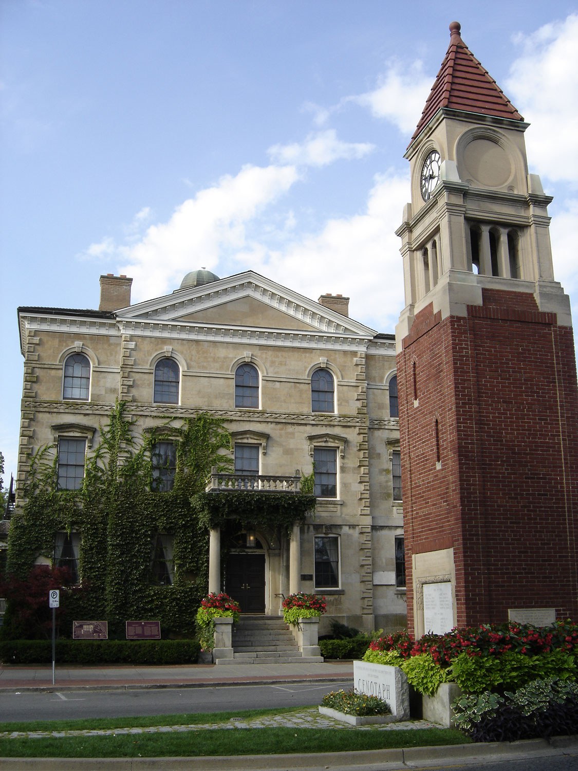
Heritage conservation districts: The most popular tool in the heritage toolkit?
When the Ontario Heritage Act came into force in 1975, municipalities across the province suddenly had the authority to protect and enhance “groups of properties...

- 10 May 2013
- Buildings and architecture
Community
Tools for conservation - Author: Mark Warrack,
How districts change
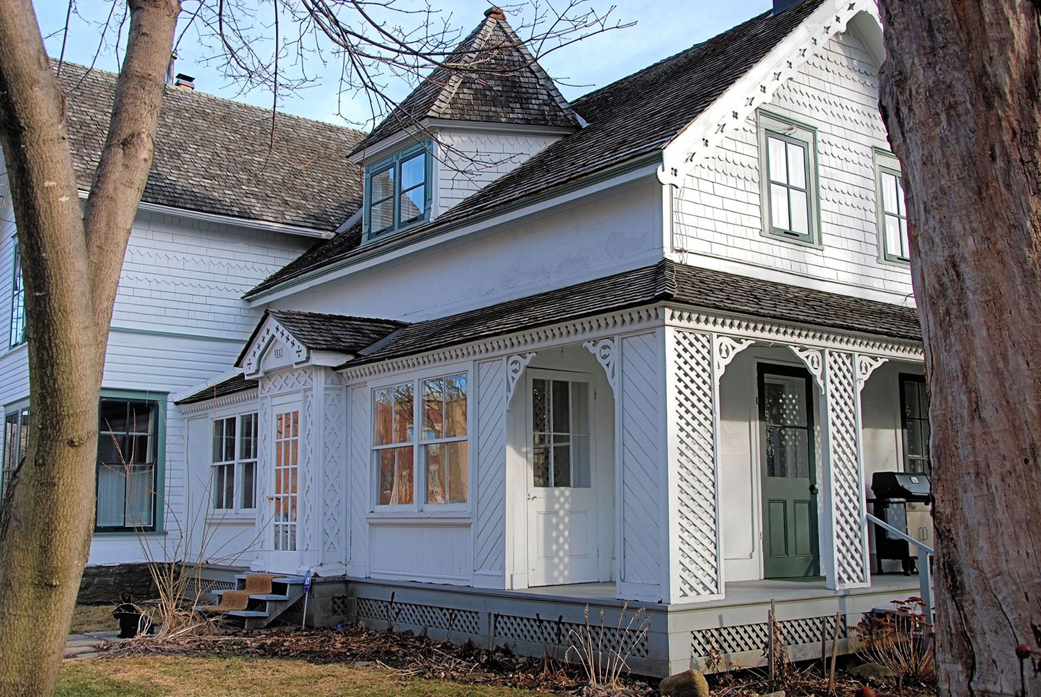
Meadowvale Village – a once-small, rural village – is located on the Credit River at the north end of the City of Mississauga. In the...
- 10 May 2013
- Buildings and architecture
Community
Tools for conservation - Author: Joan Mason,
Grassroots heritage: The stewards of New Edinburgh
Located in the City of Ottawa at the confluence of the Rideau and Ottawa rivers is the historical community of New Edinburgh. With its roots...

- 10 May 2013
- Buildings and architecture
Community - Author: Stephen Ashton,
Heritage conservation people
Growing up in Port Hope fostered a belief that every community had an amazing main street. That ignorance was shaken when I returned from university...
The Goderich story: A lesson in survival
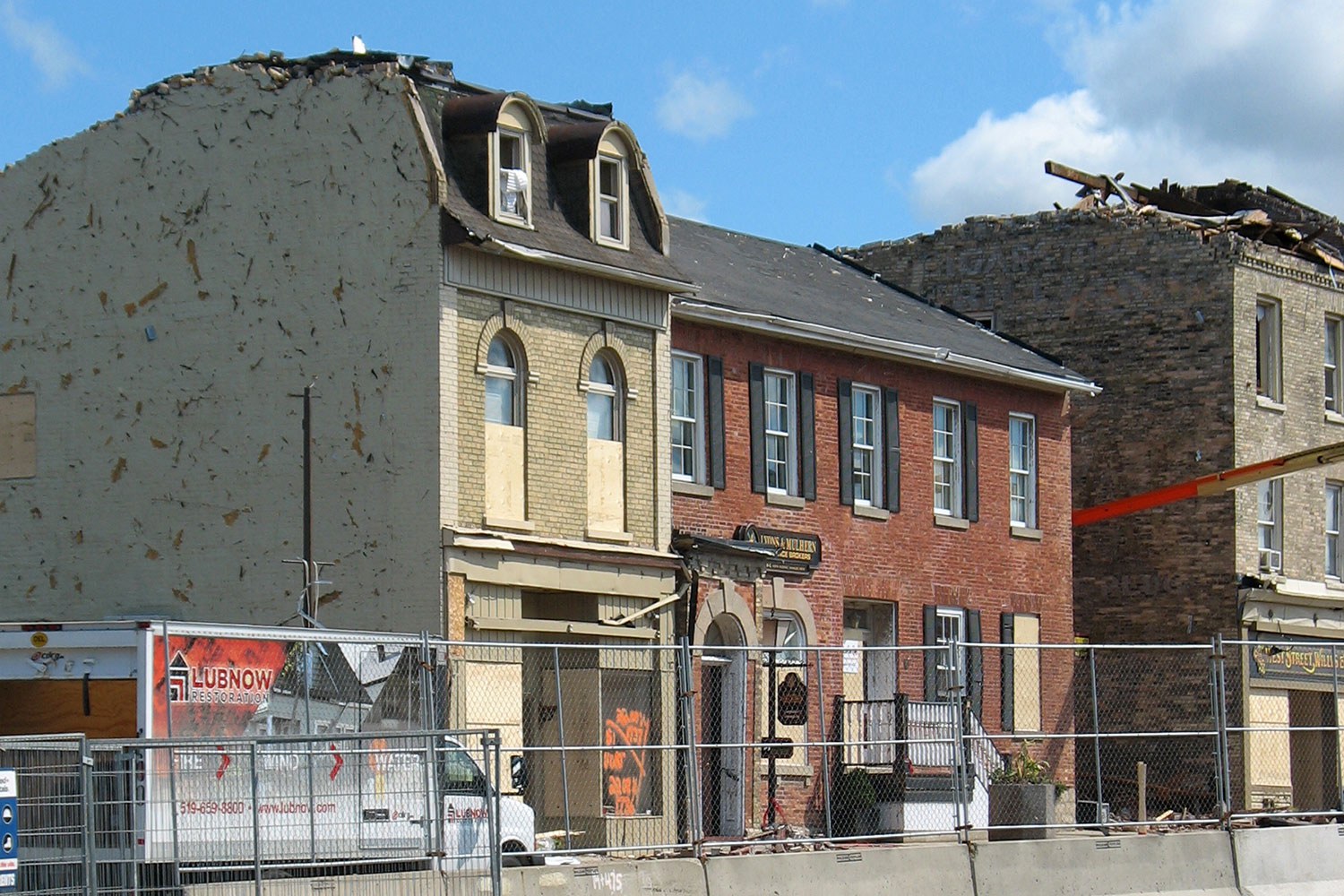
For the past 18 months, West Street in Goderich has been as much a construction site as it has a place of service and retail...
- 15 Feb 2013
- Buildings and architecture
Arts and creativity - Author: Bruce Beaton,
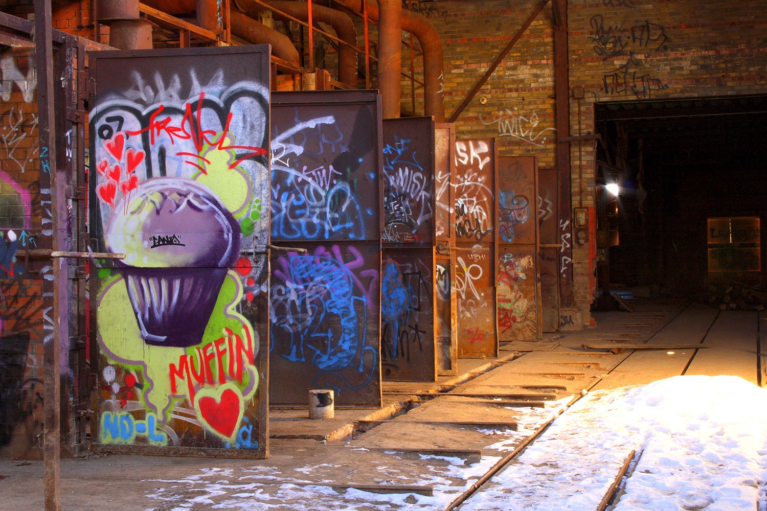
Off the wall
Storytelling takes inspiration from many sources. Traditionally, museums weave a narrative from real objects: a vase, a coat, a building or a historical site. At...

- 12 Oct 2012
- Buildings and architecture
- Author: David Nattress,
Keeping Ontario’s farm heritage alive
In our ever-expanding world, less arable land is available to grow the food we need to survive. As farms disappear across Ontario, buildings and implements...
- 31 May 2011
- Buildings and architecture
Adaptive reuse - Author: Thomas Wicks,
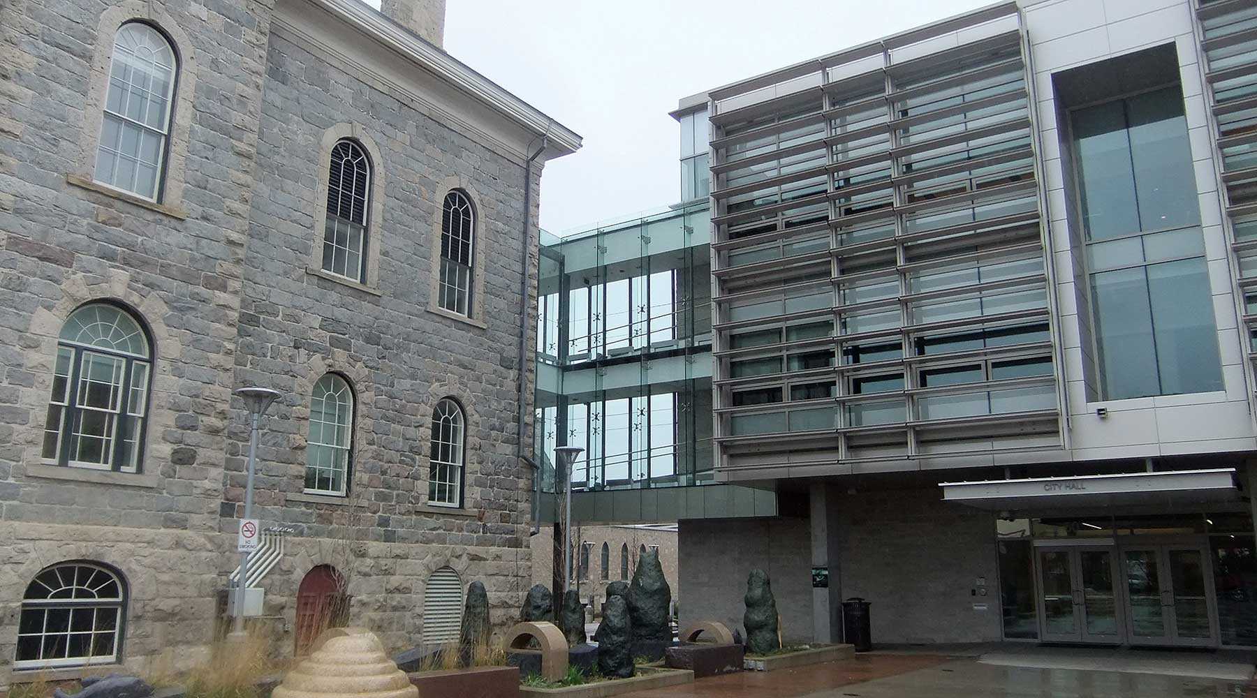
Heritage in the public realm: Everything old is new
Ontario is growing. As municipalities across the province expand, so too does the need to revitalize existing municipal facilities to house and adapt to new...
- 31 May 2011
- Buildings and architecture
Natural heritage
Community
Tools for conservation - Author: Sean Fraser, Erin Semande and Mike Sawchuck,
Investing in preservation
It is an unfortunate reality that the preservation of our heritage remains the exception rather than the norm. What is a common-sense approach to living...

- 31 May 2011
- Buildings and architecture
- Author: Wayne Kelly,
The roots of democracy: Ontario’s first parliament buildings
As the bicentennial of the War of 1812 approaches, excitement is building at the site of Ontario’s first parliament buildings in Toronto. Responding to fears...
- 28 Jan 2011
- Women's heritage
Buildings and architecture
Arts and creativity
Adaptive reuse - Author: Catrina Colme,
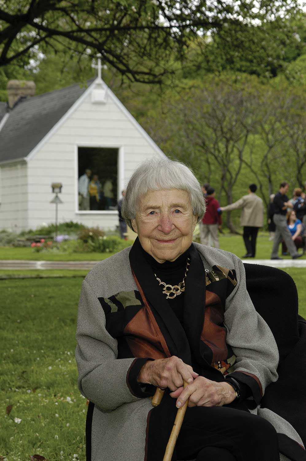
Doris McCarthy’s Fool’s Paradise will inspire future generations of artists
With the passing of Doris McCarthy on November 25, 2010, the country lost a revered and talented artist, best known for her landscape paintings. McCarthy’s...
- 28 Jan 2011
- Buildings and architecture
Community - Author: Michael Eamon,
Into the Kawarthas
When visitors first enter Peterborough’s stately city hall, they should look down. Inspired by the City Beautiful Movement – active in Canada from 1893 to...
- 28 Jan 2011
- Buildings and architecture
Community
Adaptive reuse - Author: Barb McIntosh,
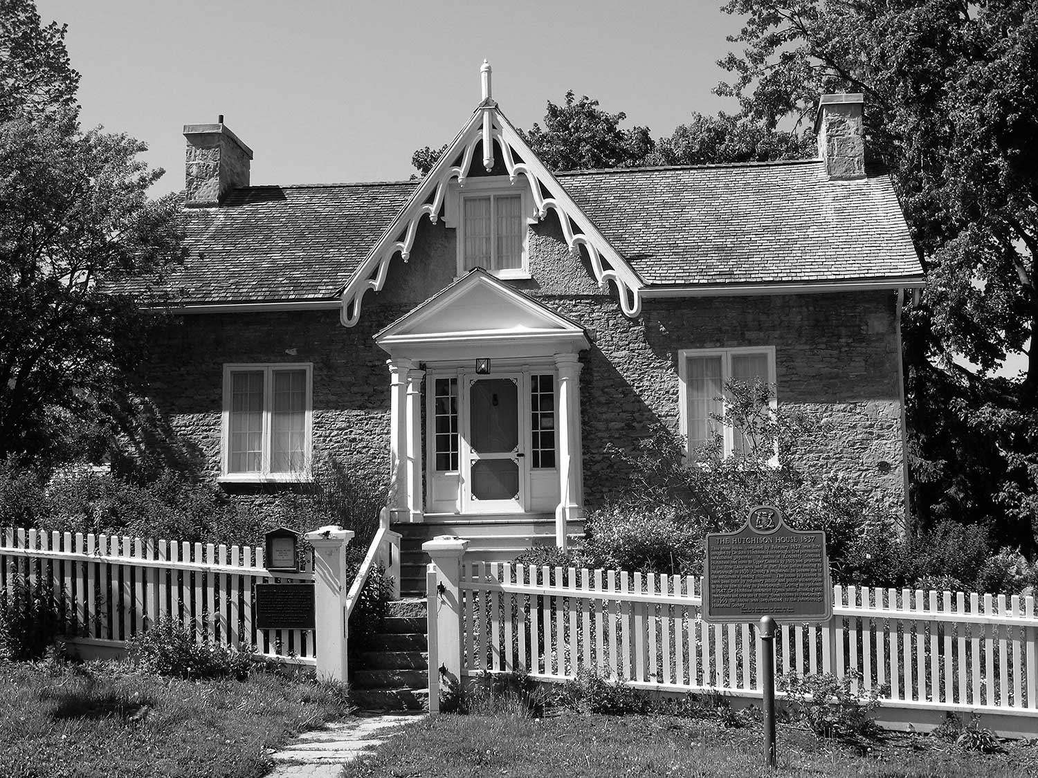
Peterborough’s Living History Museum
Hutchison House holds a special place in the social history of Peterborough. Local volunteers built the house in 1836 to persuade one of their first...

- 28 Jan 2011
- Buildings and architecture
- Author: Jim Leonard,
Recovering from disaster
On the afternoon of July 14, 2004, the skies opened up over the city of Peterborough. Throughout the day, evening and especially overnight, the city...
- 28 Jan 2011
- Buildings and architecture
- Author: Dennis Carter-Edwards,
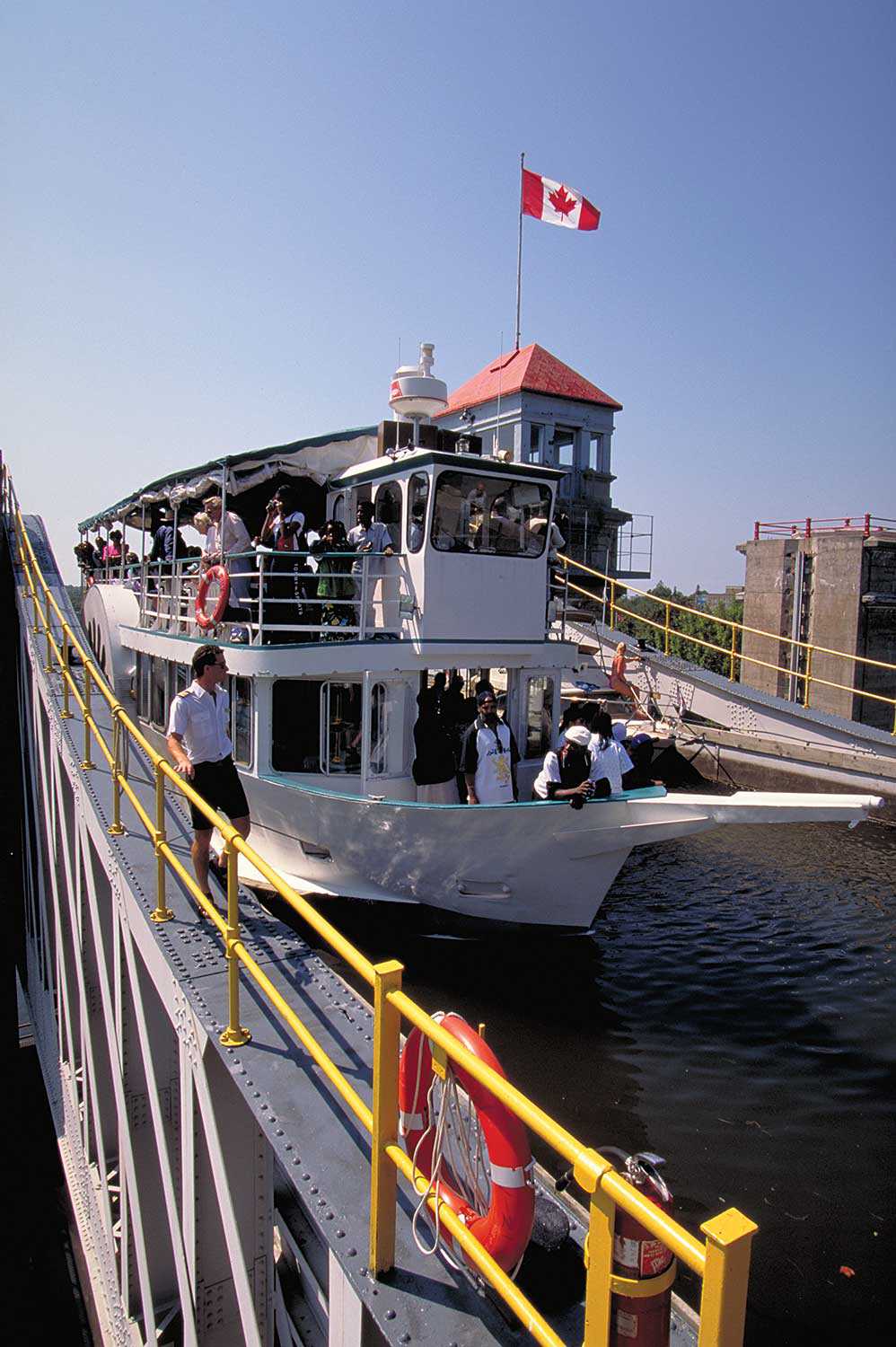
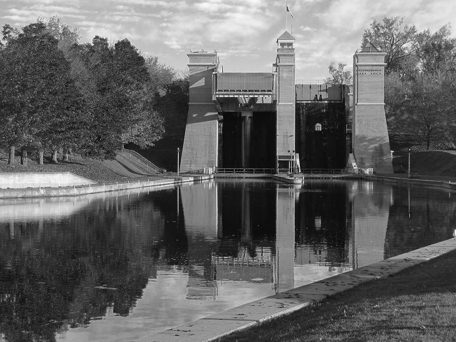
Exploring the Trent -Severn Waterway
Built over a period of 87 years, the Trent-Severn Waterway stretches 386 kilometres across the heartland of the province, linking Lake Ontario with Georgian Bay...

- 06 May 2010
- Buildings and architecture
Community - Author: Ontario Heritage Trust,
Resources: Finding our place in Ontario’s history
On the shelf Creating Memory, by John Warkentin Becker Associates, 2010. Toronto has over 6,000 public outdoor sculptures, works of art that provide a sense...
- 06 May 2010
- Buildings and architecture
Community - Author: Regan Hutcheson and Leah Wallace,
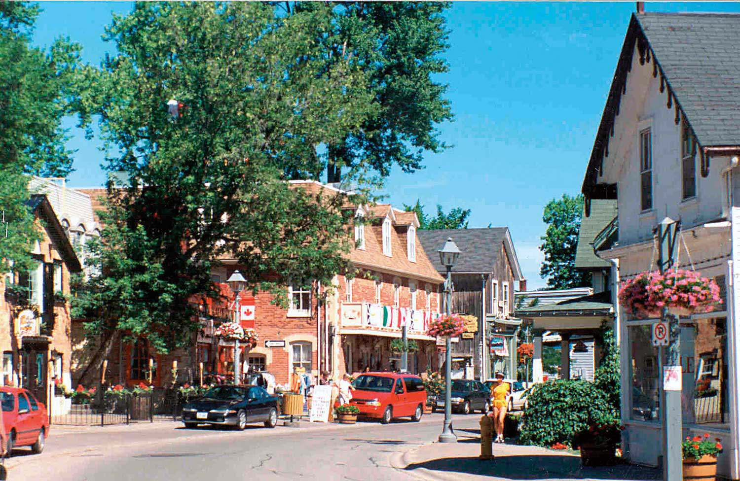
Designations in bulk
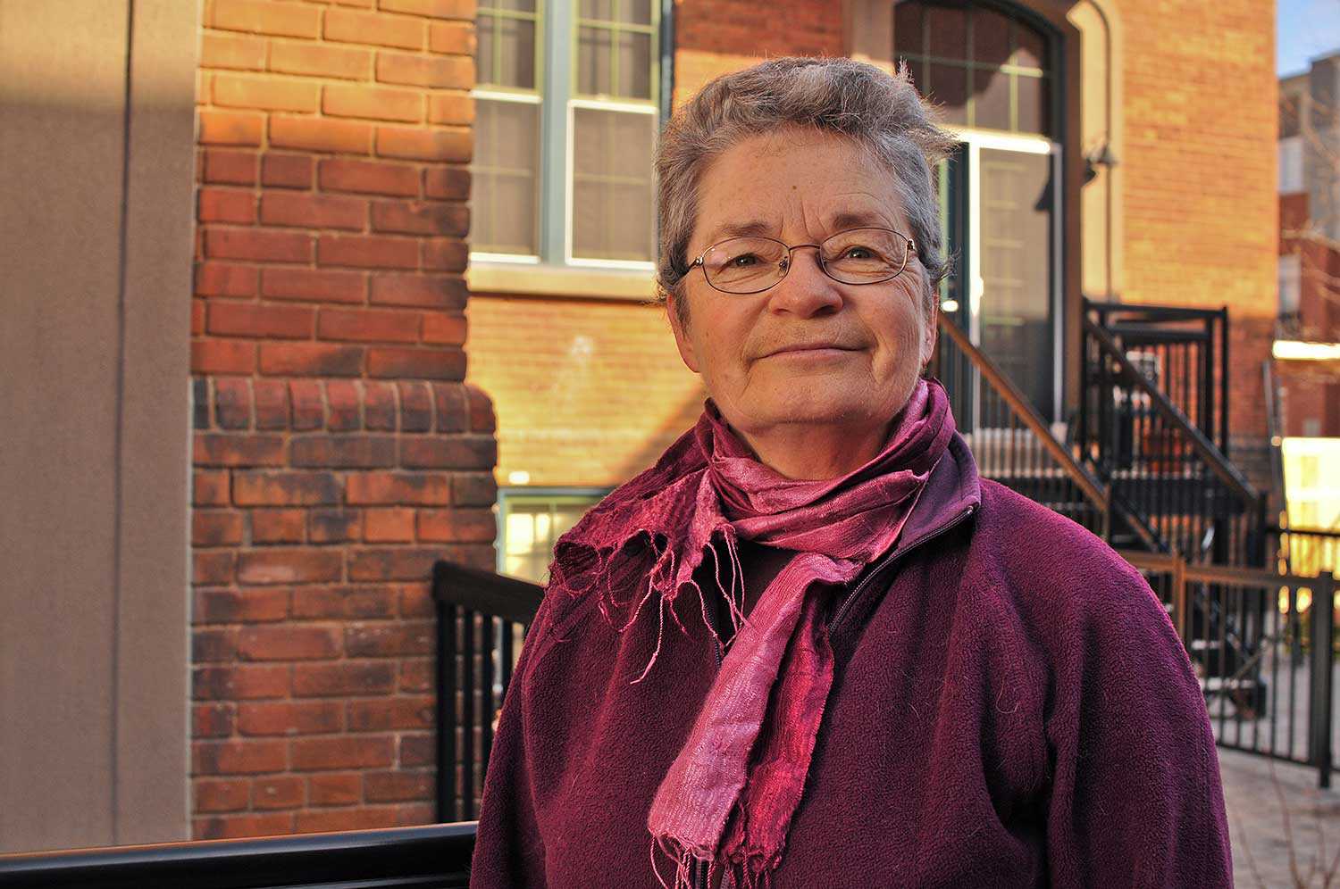
Understanding Unionville, by Regan Hutcheson A visit to Unionville is like a journey back in time. Located north of Toronto in the heart of Markham...
- 06 May 2010
- Buildings and architecture
Community - Author: Sally Coutts,
Leading by example
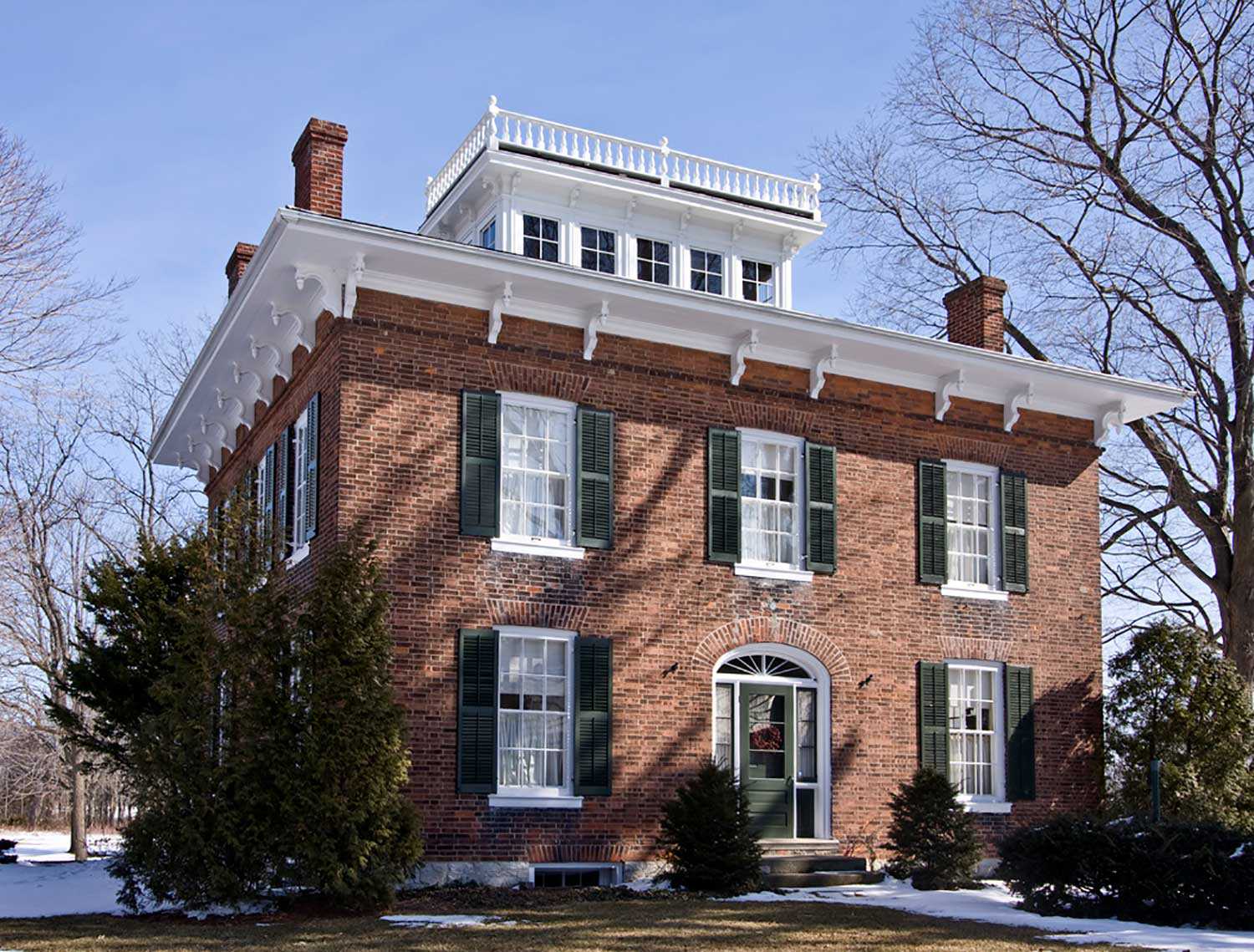
Ontario towns and cities have been designating properties under Part IV of the Ontario Heritage Act since the passage of the act in the 1970s...
- 06 May 2010
- Buildings and architecture
Community - Author: Dave Benson,
Cataloguing a community
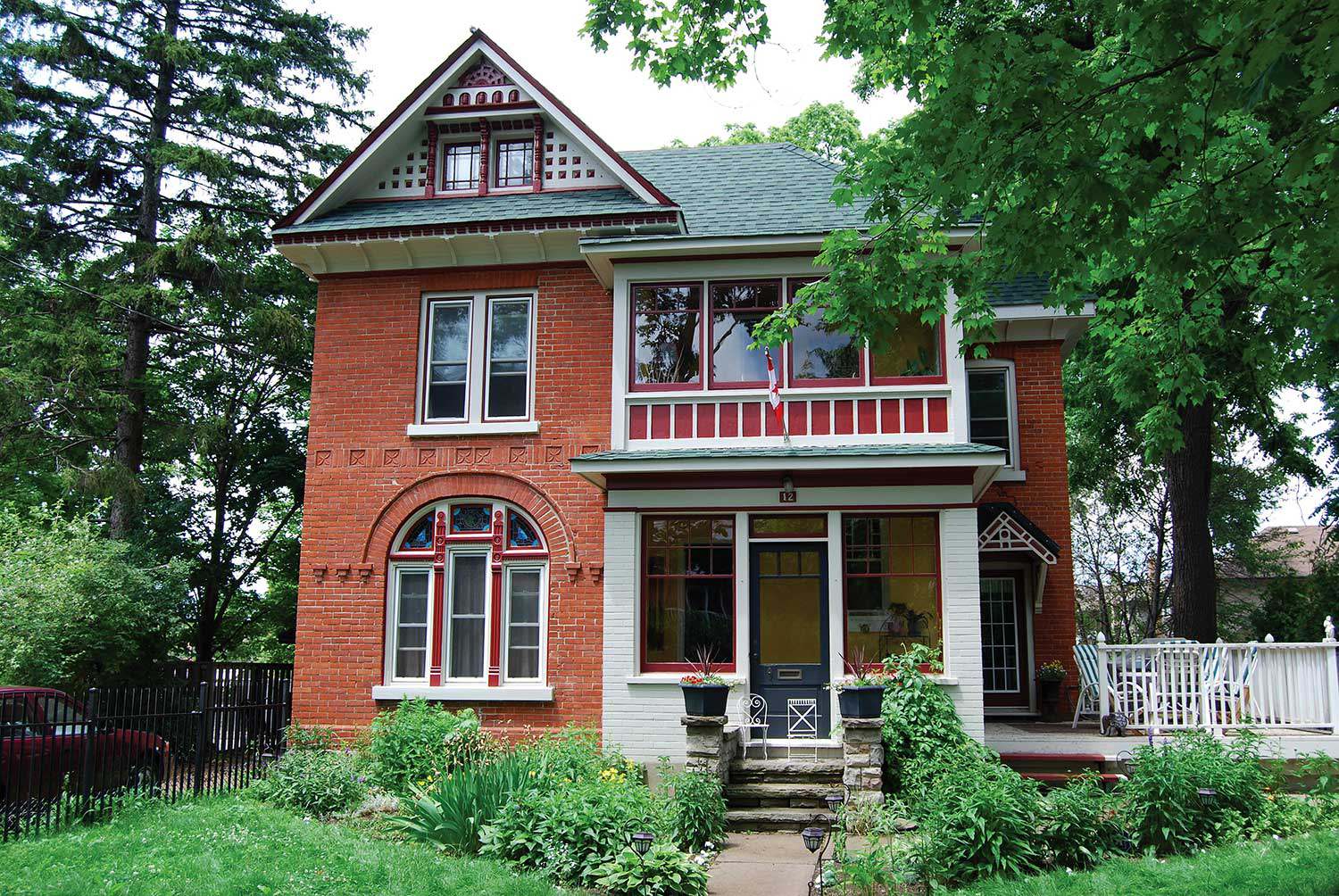
The amalgamated municipality of Chatham-Kent includes a number of early settlements that encompass thousands of heritage buildings. Recently, Heritage Chatham-Kent (HC-K), our municipal heritage committee...
- 06 May 2010
- Buildings and architecture
- Author: Jim Leonard,
What a difference a day makes
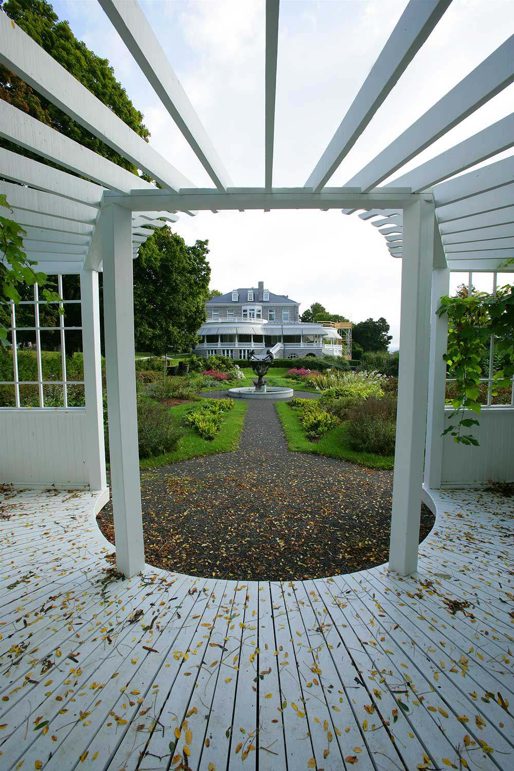
On March 11, 2009, Brampton City Council designated 17 individual properties under Part IV (Section 29) of the Ontario Heritage Act. The simultaneous passing of...
- 06 May 2010
- Buildings and architecture
- Author: Romas Bubelis,
Tracking Olmsted in Ontario
An undiscovered legacy of work left by landscape architects Charles and Frederick Olmsted Jr. exists in fragments of landscape across Ontario. Their father, Fredrick Law...
- 06 May 2010
- Buildings and architecture
- Author: Romas Bubelis,
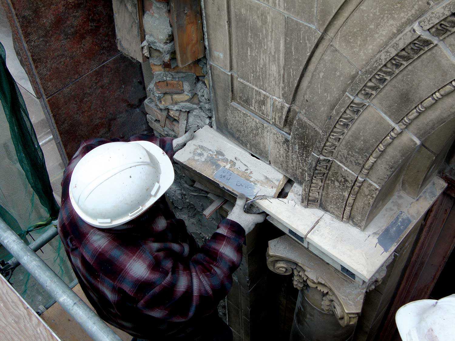
Maintaining a national treasure
Toronto’s Elgin and Winter Garden Theatre Centre is an inward-looking building of interior architecture. The exterior, by contrast, appears massive but plain. The singular exception...
- 11 Feb 2010
- Buildings and architecture
Community - Author: Evelyn G. McLean,
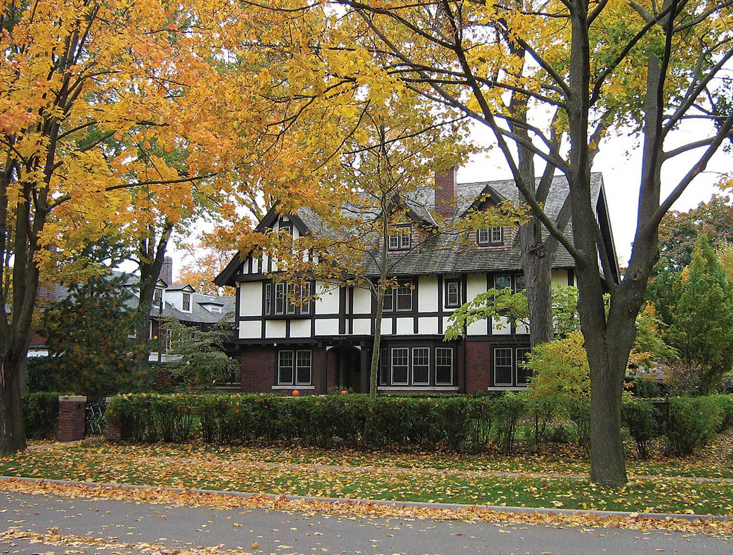
Walkerville: The heritage of a company town
Among the shrinking number of 19th-century company towns, Walkerville – part of the City of Windsor since 1935 – remains an outstanding example of what...
- 11 Feb 2010
- Buildings and architecture
- Author: Kiki Aravopoulos,
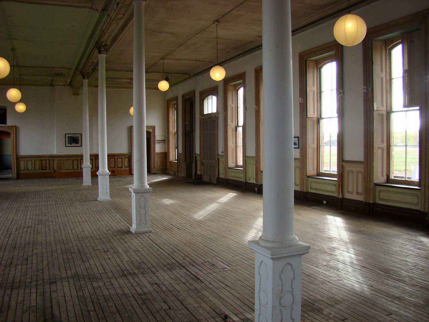
Seeing better days
The St. Thomas Canadian Southern Railway station (CASO) occupies a prominent position on the city’s main street. Perhaps it is the station’s sheer size –...
- 11 Feb 2010
- Buildings and architecture
Community - Author: Kathryn McLeod,
Exploring Ontario’s southern peninsula
As you roam the highways and waterways of Ontario’s southern peninsula, a tapestry of stories unravels. These stories speak about settlement and growth, a testament...
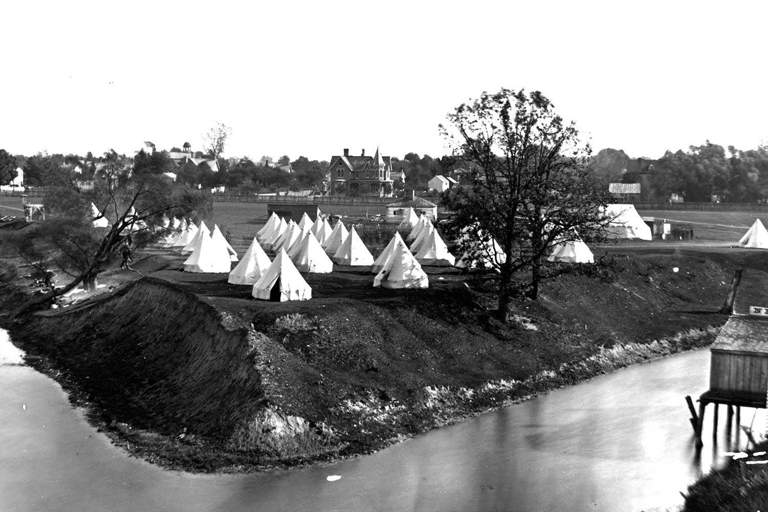
- 11 Feb 2010
- Buildings and architecture
Community
Cultural landscapes - Author: Dave Benson,
The history of Chatham-Kent
Chatham-Kent’s rich cultural heritage began long before European settlement when large stockaded villages and Neutral Indians dominated the Thames River and the Lake Erie-Lake St...

- 10 Sep 2009
- Buildings and architecture
Community - Author: Alison Little,
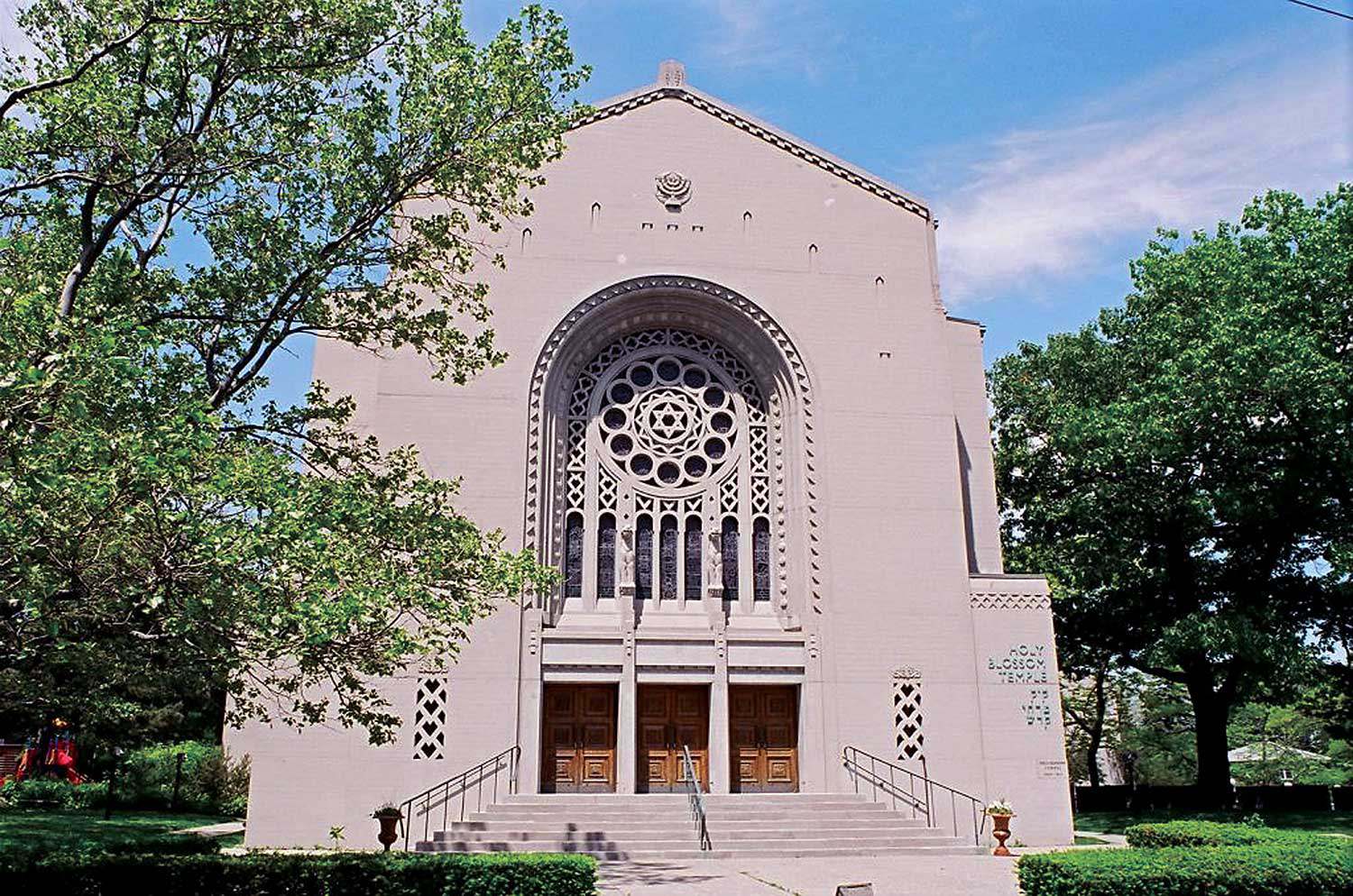
A legacy of support: Faith-based community
Reaching out to those in need has long been a part of Ontario’s religious tradition. Faith-based groups offering medical and social assistance arrived with the...
- 10 Sep 2009
- Buildings and architecture
Community - Author: Jennifer Drinkwater,
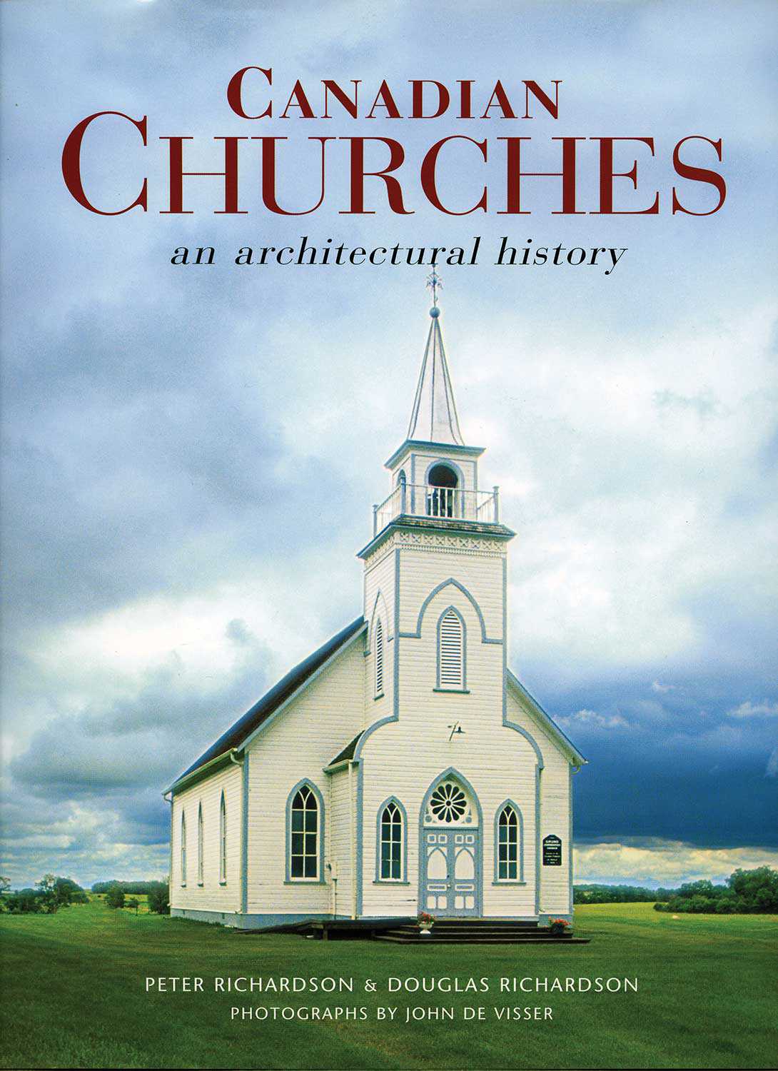
Toronto’s synagogues: Keeping collective memories alive
Collective memory is cultural memory – what is remembered about an event by a social or cultural group that experienced it and by those to...
- 10 Sep 2009
- Buildings and architecture
- Author: Ontario Heritage Trust,
Places of Worship resources
Publications Churches: Explore the symbols, learn the language and discover the history, by Timothy Brittain-Catlin Collins Press. Churches and cathedrals, intentionally imposing and dignified, contain...
- 10 Sep 2009
- Buildings and architecture
- Author: Marybeth McTeague,
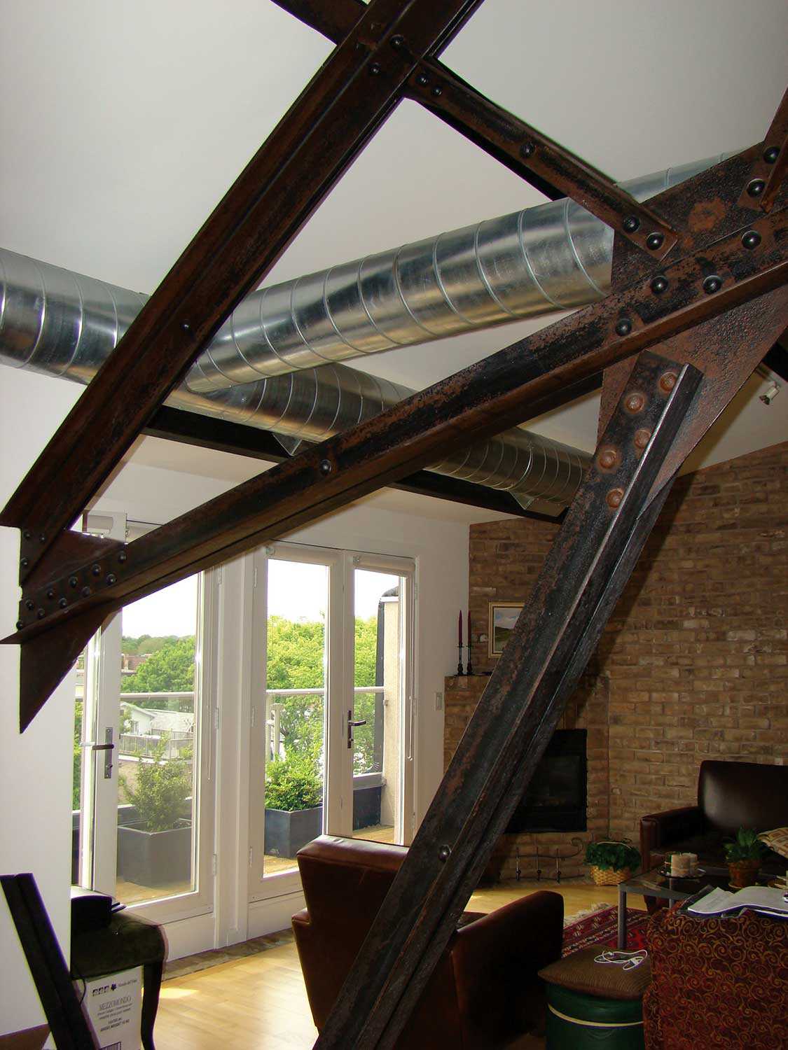
Ontario’s postwar places of worship: Modernist designs evoke traditional styles
The years following the Second World War were characterized by a sense of renewal and optimism. Places of worship built in Ontario during this period...
- 10 Sep 2009
- Buildings and architecture
Adaptive reuse - Author: Jennifer Laforest,
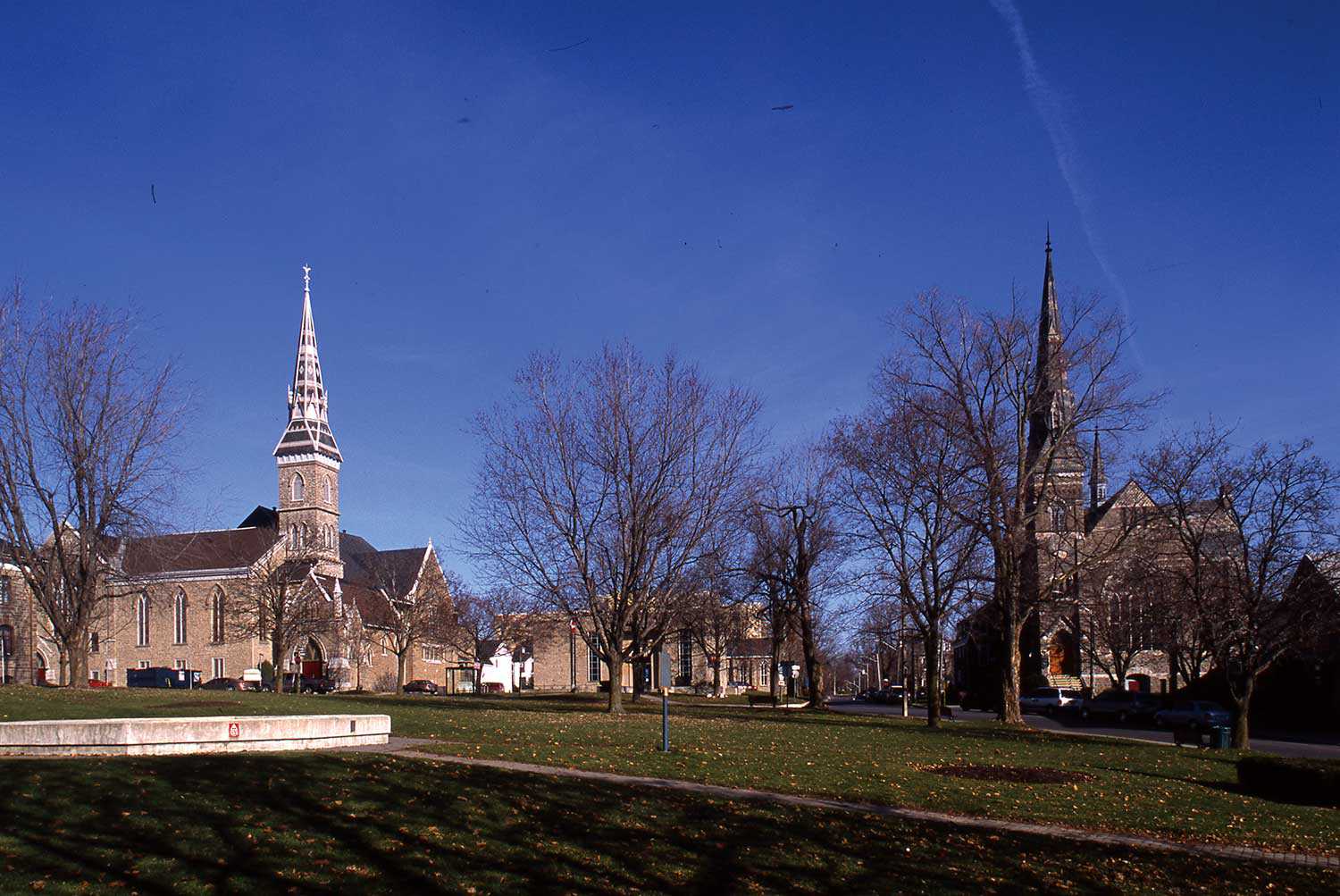
Adapting today’s places of worship
Adaptive reuse of religious buildings can simultaneously preserve significant heritage sites and benefit communities, but in Ontario those who want to make these conversions face...
- 10 Sep 2009
- Buildings and architecture
- Author: Candace Iron and Malcolm Thurlby,
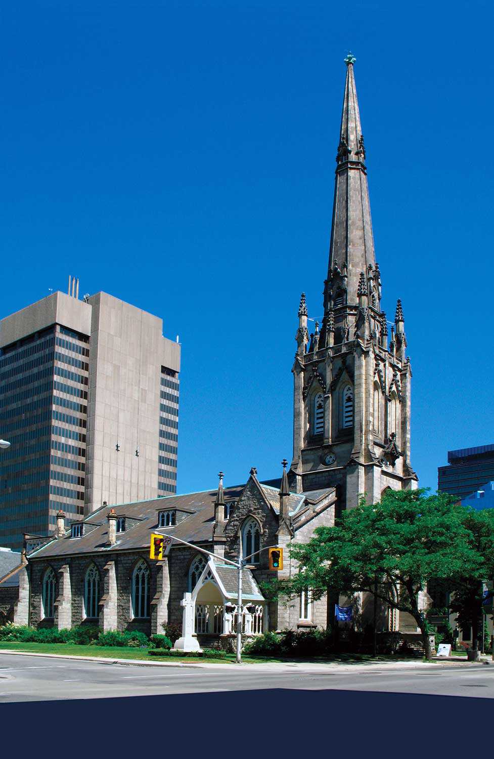
Gothic traditions in Ontario churches
The importance of worship in 19th-century Ontario can be measured by the church buildings erected in the province during that time. Invariably, Ontario denominations turned...
- 10 Sep 2009
- Buildings and architecture
Community - Author: David Cuming,
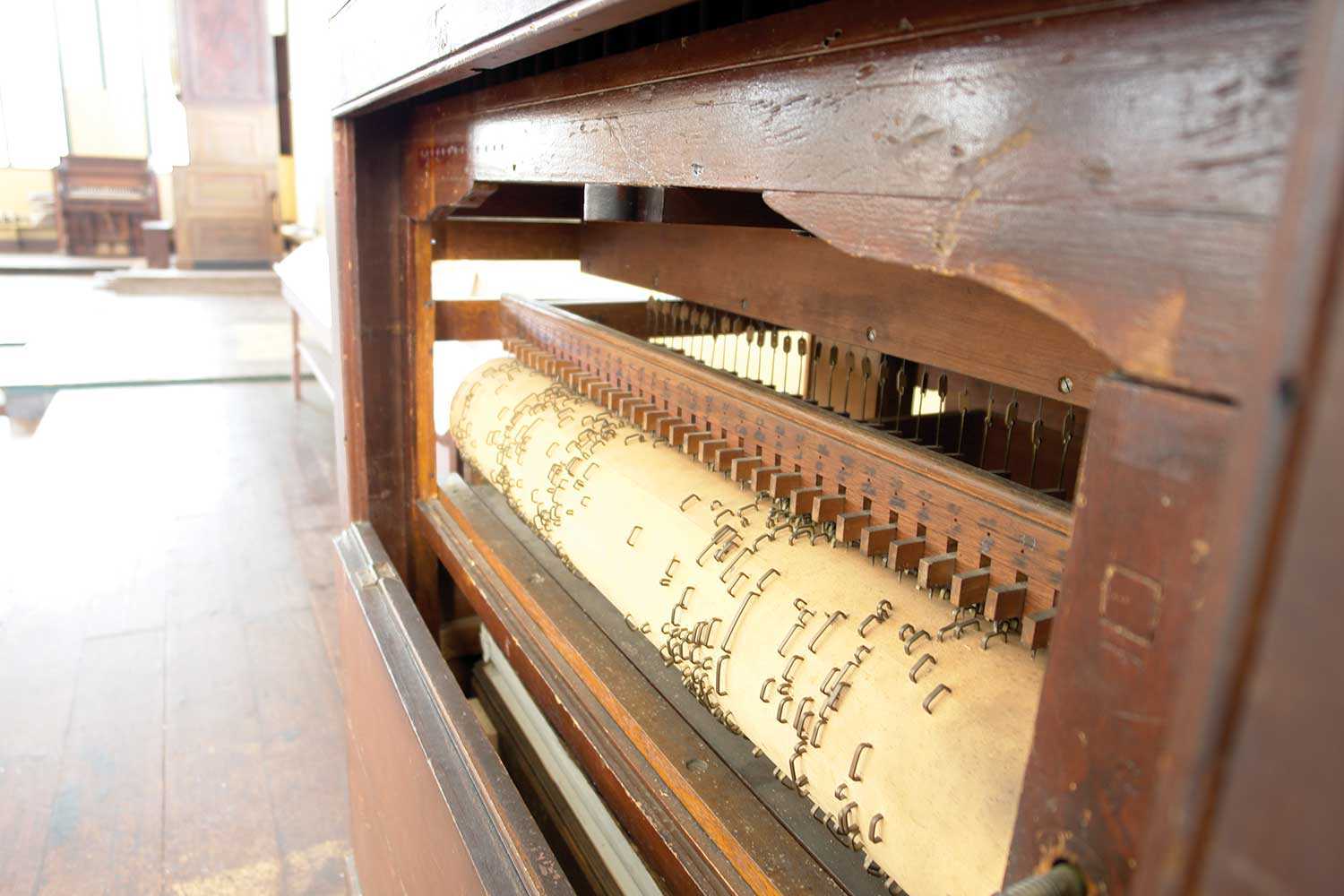
From Hamilton, a municipal perspective
Places of worship are often stunning buildings, constructed in forms and styles that have existed for thousands of years around the world, using specialized techniques...
- 10 Sep 2009
- Buildings and architecture
Arts and creativity - Author: Nicholas Holman,
The music of worship
Goethe said that “architecture is frozen music,” but why did he say this? Was it because Christian church interiors, with their columns and arches, seem...

- 10 Sep 2009
- Buildings and architecture
Arts and creativity - Author: Erin Semande,
Art in the church and the church in art: Work of the Group of Seven
Talented and renowned artists have long been commissioned to decorate the interiors of places of worship, where they often turn the walls and ceilings into...

- 10 Sep 2009
- Buildings and architecture
Community - Author: Vicki Bennett,
Form and function: The impact of liturgy, symbolism and use on design
During the 19th century, the location, physical condition and stylistic merit of churches were publicly discussed as reliable indicators of a community’s value, moral fabric...
- 10 Sep 2009
- Buildings and architecture
Community - Author: Jane Burgess and Ann Link,
Enduring stewardship preserves a treasured heritage church
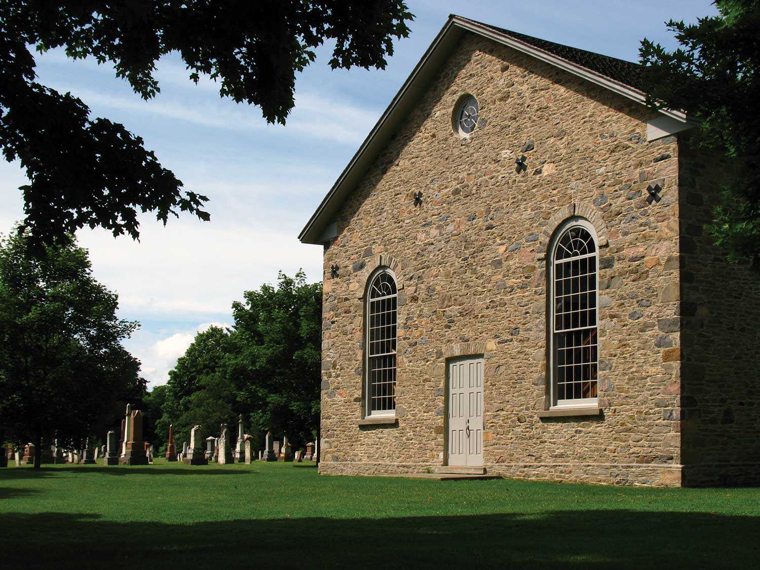
Located just east of Beaverton, the Old Stone Church, built in 1840 by a predominantly Scottish congregation, is a simple but handsomely proportioned small Georgian...
- 10 Sep 2009
- Buildings and architecture
Community - Author: Laura Hatcher,
The changing face of worship
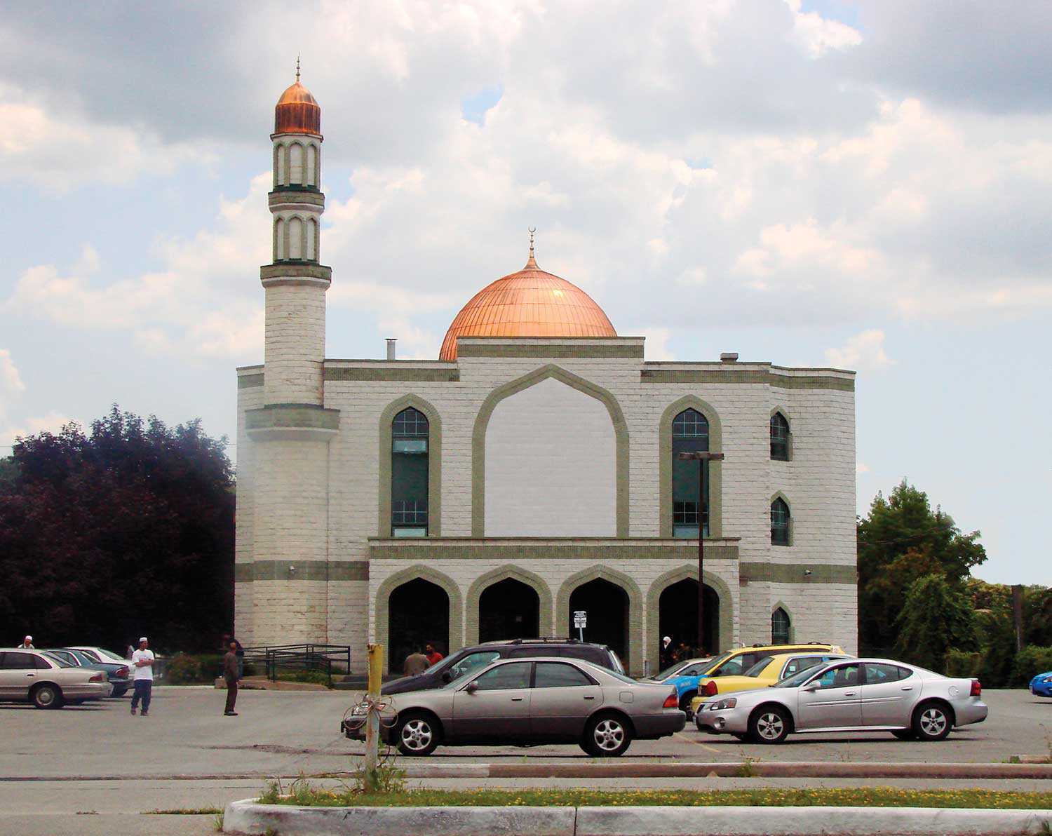
The architectural style, massing, materials and date stones of a place of worship offer clues about the congregation’s history and values. Likewise, the building’s size...
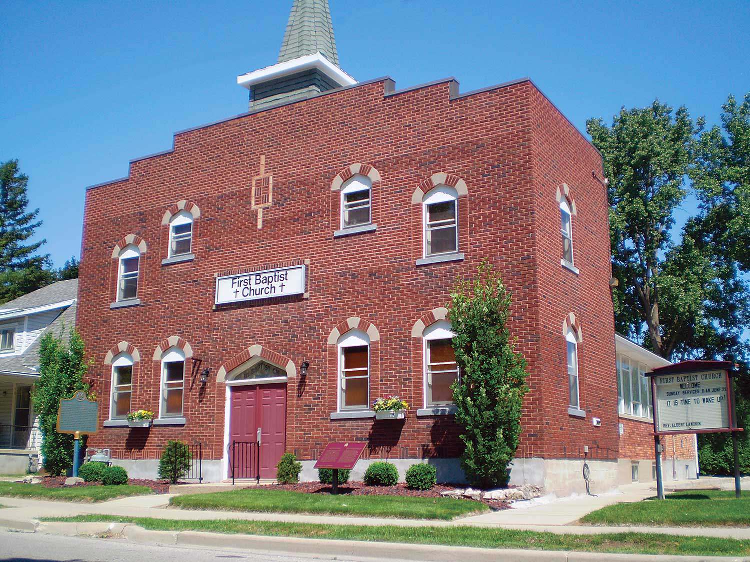
Religious freedom in the promised land
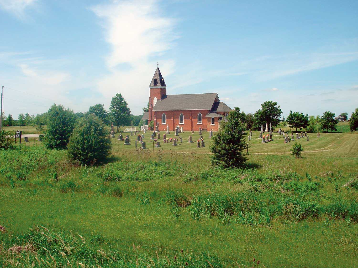
Eli Johnson toiled on plantations in Virginia, Mississippi and Kentucky before making his bid for freedom in the “promised land” – the term used by...
- 10 Sep 2009
- Buildings and architecture
Community
Cultural landscapes - Author: Wendy Shearer,
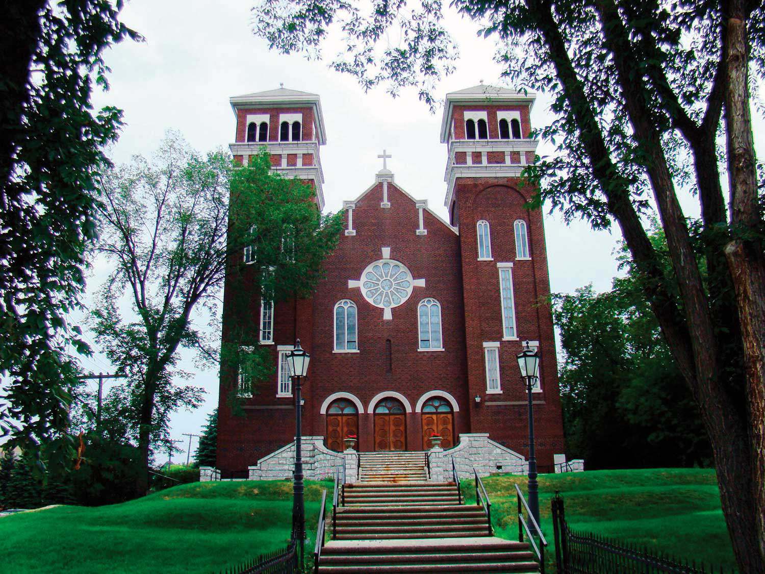
Places of worship in Ontario’s rural cultural landscape
The cultural landscapes of rural southern Ontario contain a variety of heritage resources – land patterns and uses, built forms and natural features. Within these...
- 10 Sep 2009
- Indigenous heritage
Buildings and architecture
Community - Author: Yves Frenette,
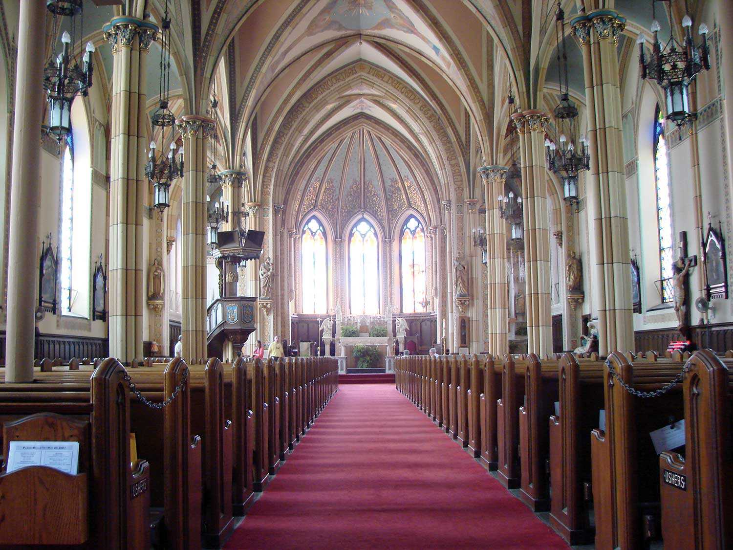
Churches of “New Ontario”
In the middle of the 19th century, northern Ontario remained much as it had been under the French regime – a region of Catholic missions...
- 10 Sep 2009
- Indigenous heritage
Buildings and architecture
Francophone heritage
Community - Author: Wayne Kelly,
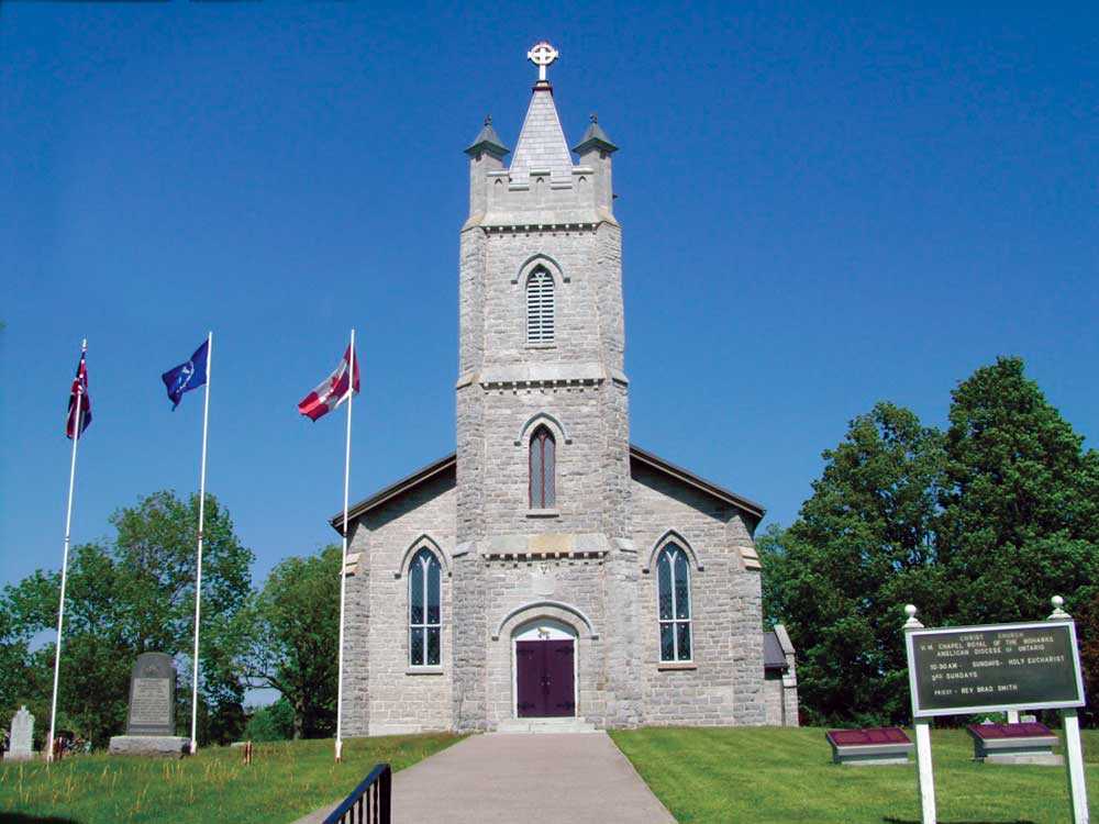
Ontario’s rich religious heritage
From the First People who for thousands of years conducted religious and cultural ceremonies at places they believed held spiritual significance, to subsequent arrivals who...
- 10 Sep 2009
- Indigenous heritage
Buildings and architecture
Community
Cultural objects - Author: Kathryn McLeod,
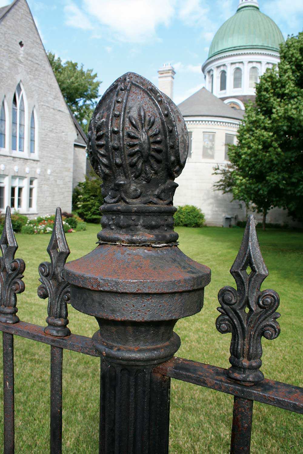
Christ Church and the Queen Anne Silver
Located in Tyendinaga Mohawk Territory on the Bay of Quinte, Christ Church houses a silver communion service dating to 1712. This remarkable service represents an...
- 10 Sep 2009
- Buildings and architecture
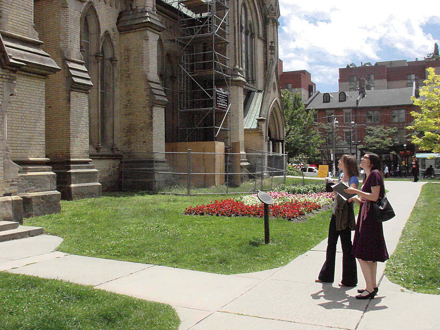
Cultural landscapes - Author: Marcus R. Létourneau,
Sacred landscapes in Ontario’s communities
While places of worship are a visible aspect of Ontario’s heritage, they are part of wider cultural landscapes that can include supporting structures, burial places...
- 10 Sep 2009
- Buildings and architecture
Community - Author: Richard Moorhouse,
Launching the Places of Worship Inventory
Survey, documentation and research – these are the first steps in the conservation process. How can decisions be made about our heritage without first acquiring...

- 10 Sep 2009
- Buildings and architecture
Arts and creativity
Cultural objects - Author: John Wilcox,
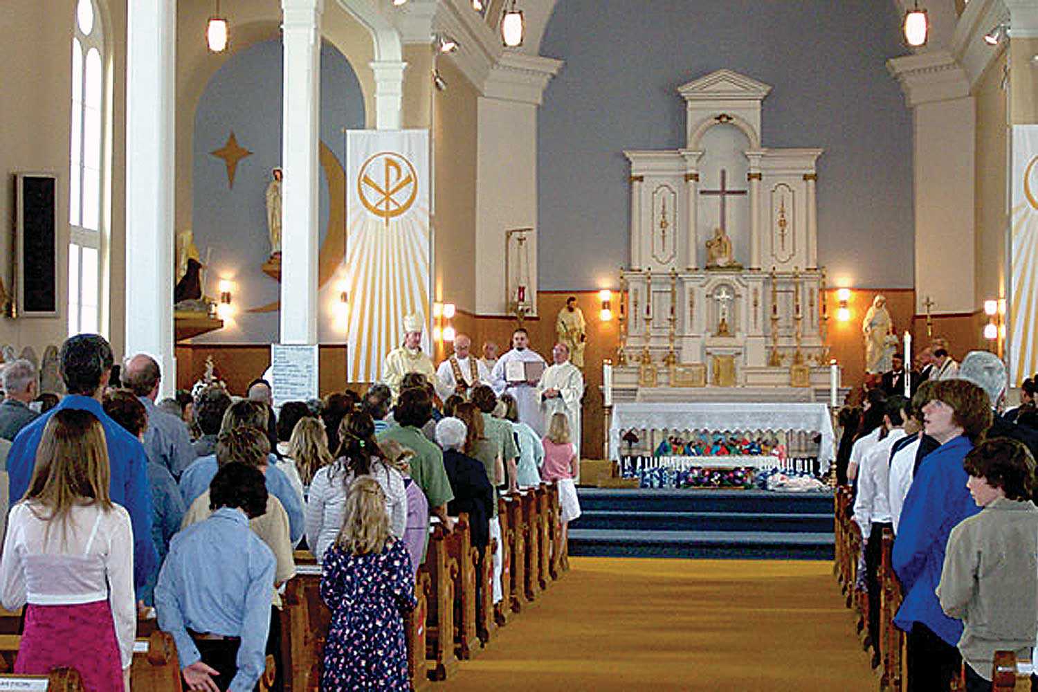
Adventures in light and colour
Light is a fundamental aspect of all architecture, especially places of worship. Light has always been considered a manifestation of the spirit, providing guidance, comfort...
- 10 Sep 2009
- Buildings and architecture
- Author: Bruce Pappin,
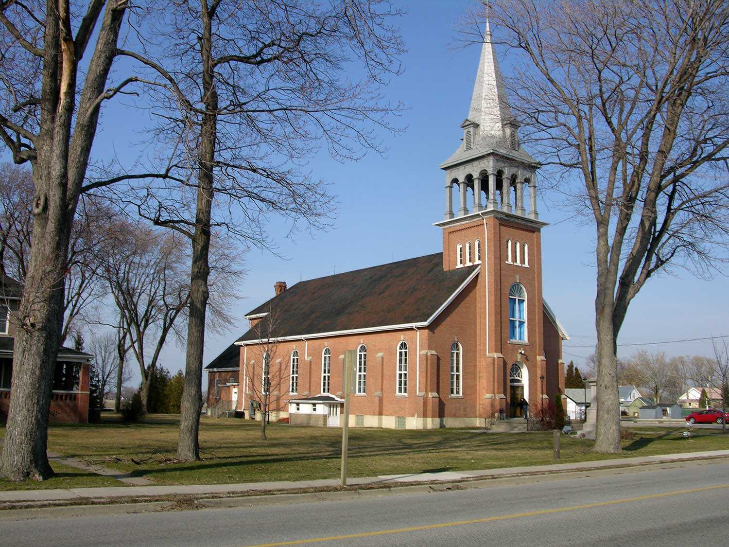
The challenge of change in the Catholic Diocese of Pembroke
In May 2006, the Catholic parish of Ste Bernadette in the small northern Ontario community of Bonfield celebrated the 100th anniversary of its church. A...
- 10 Sep 2009
- Buildings and architecture
- Author: Sean Fraser,
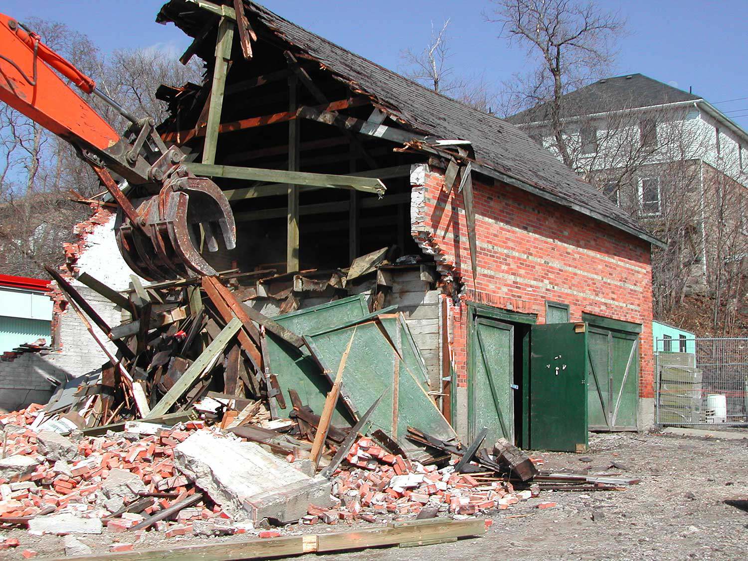
The challenges of ownership
Historic places of worship may possess cultural heritage values that engender public support for their preservation, but these values sometimes differ from the spiritual and...
- 28 May 2009
- Buildings and architecture
Community
Tools for conservation - Author: Sean Fraser,
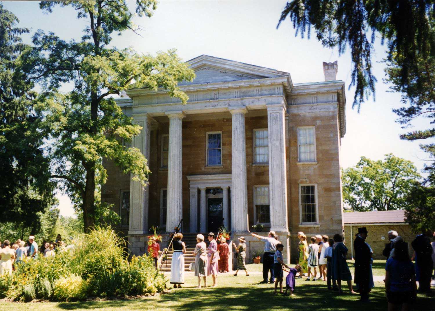
Subsidizing demolition
In nature, there is no such thing as waste. Nature operates in an endless web of interconnected cycles of use, transformation and reuse. The concept...
- 28 May 2009
- Buildings and architecture
Natural heritage
Community - Author: Tamara Chipperfield and Kiki Aravopoulos,
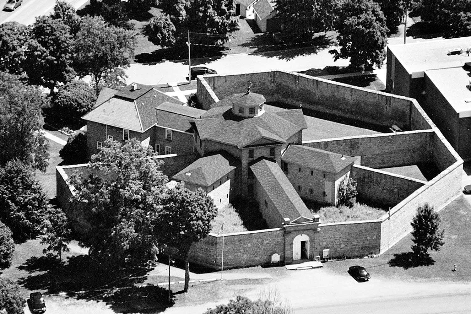
Heritage in harmony: The integration of natural and cultural landscapes
Approximately 11,000 years of human culture are recorded in Ontario’s landscapes. Most existing natural landscapes in Ontario today have intrinsic cultural heritage meaning and significance...
- 28 May 2009
- Buildings and architecture
Community - Author: Erin Semande,
The sustainability of place
Located on the Lake Huron shore at the mouth of the Maitland River, Goderich is known as “Canada’s Prettiest Town.” It is situated in what...
- 28 May 2009
- Buildings and architecture
Adaptive reuse - Author: Joe Lobko and Megan Torza,
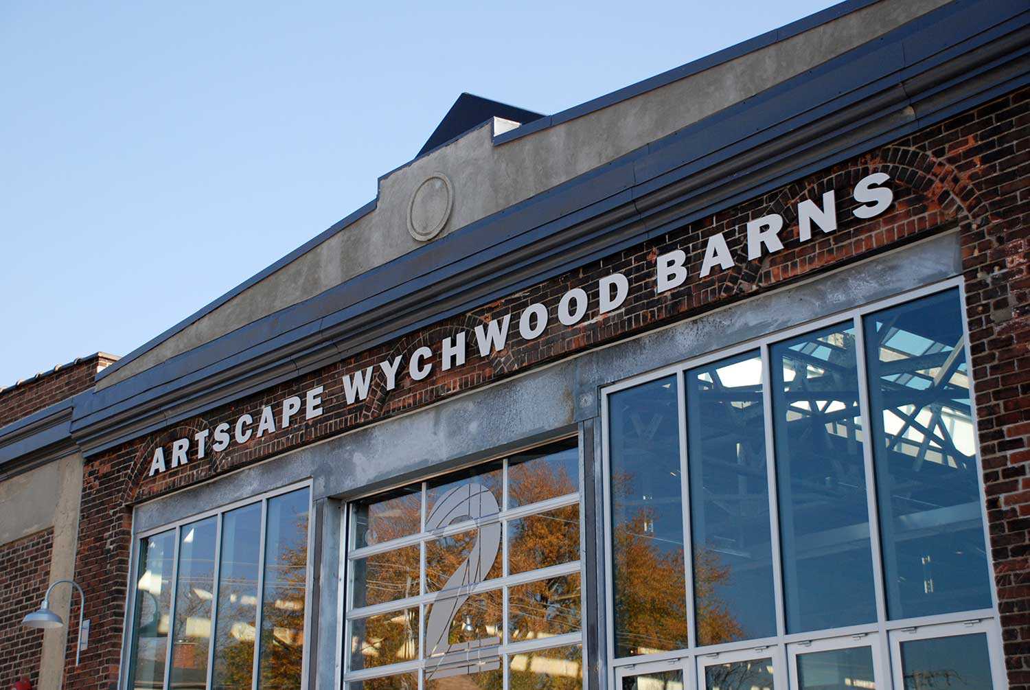
Rebirth of the Wychwood Barns
The Artscape Wychwood Barns – near St. Clair Avenue West and Bathurst Street in Toronto – were created when five historic streetcar maintenance barns were...

- 28 May 2009
- Buildings and architecture
Environment - Author: L.A. (Sandy) Smallwood,
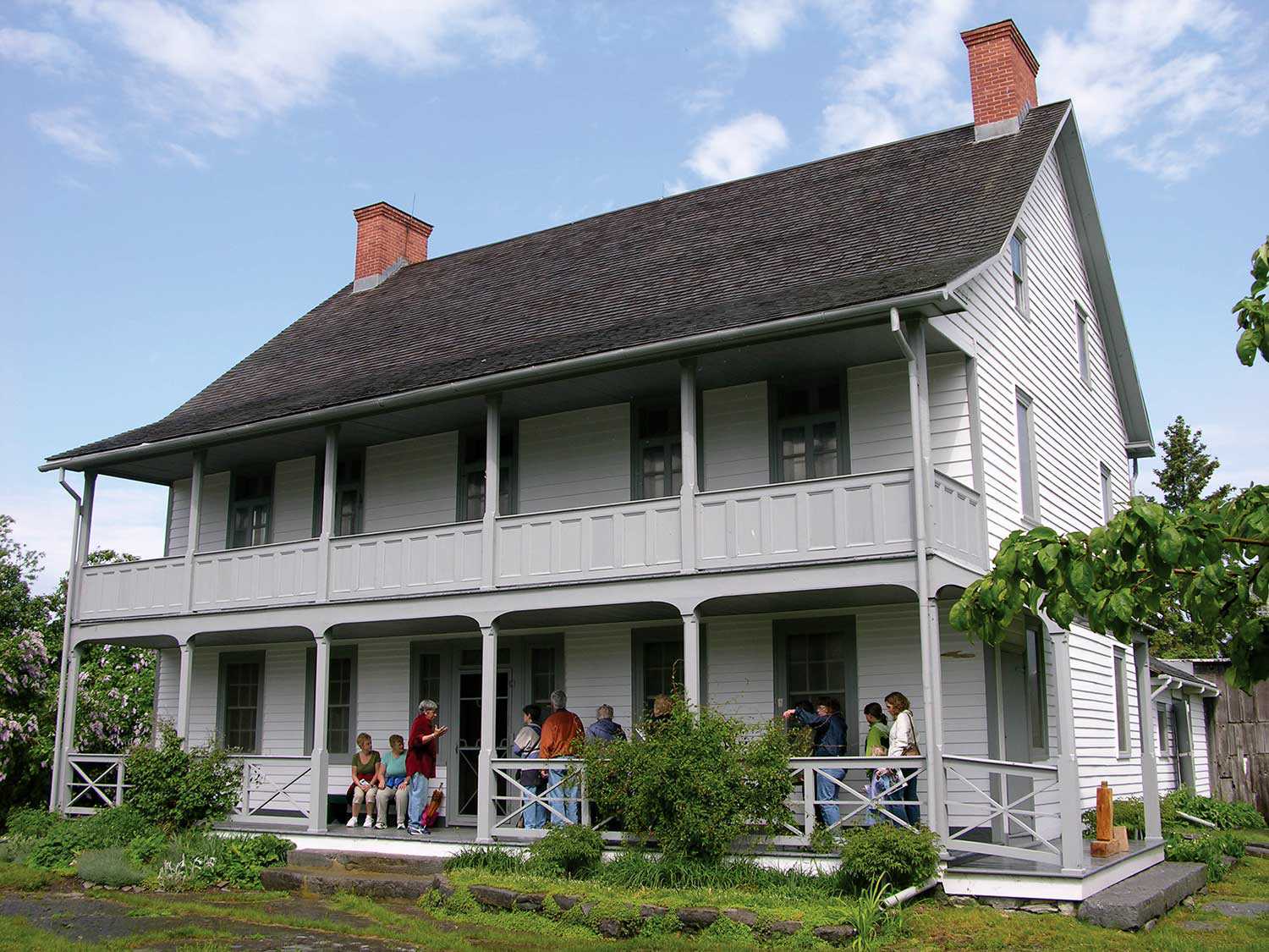
Discarding the past
When an old building is torn down, we lose more than just the structure. We lose a bit of our past. The foundation walls and...
- 12 Feb 2009
- Buildings and architecture
Community - Author: Kathryn McLeod,
Heritage off the 401
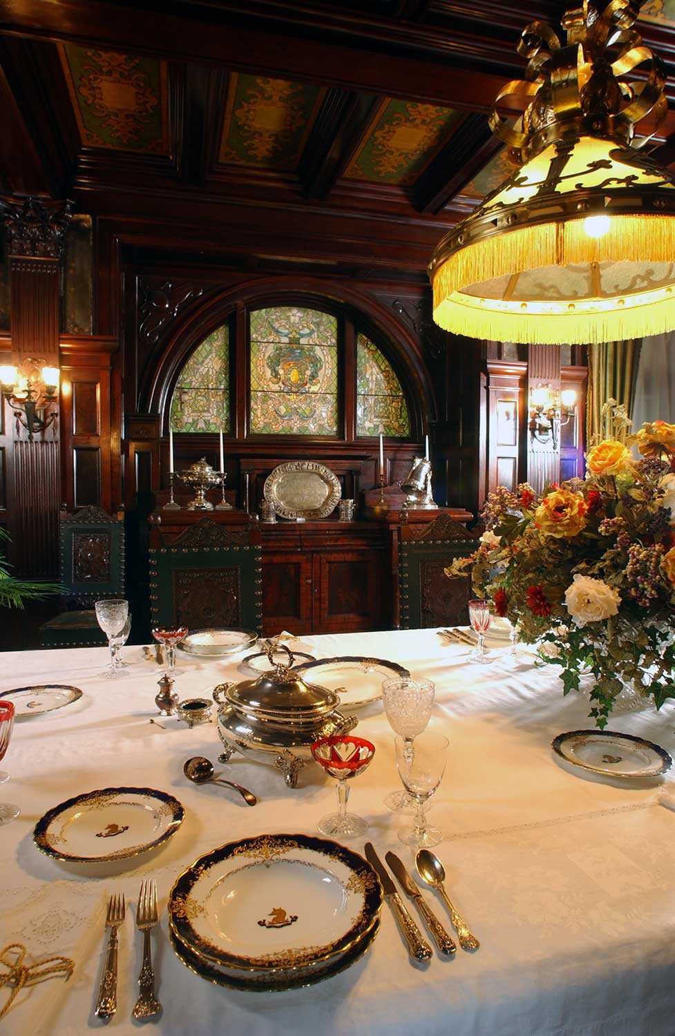
Highway 401, stretching from Windsor to the Quebec border, is one of the busiest highways in North America. Anyone who has journeyed east of Toronto...
- 12 Feb 2009
- Buildings and architecture
Community - Author: Romas Bubelis,
Building on the past
Eastern Ontario offers an array of impressive historic houses. Some of these houses – owned and operated by the Ontario Heritage Trust – are featured...

- 12 Feb 2009
- Buildings and architecture
- Author: Michael Vidoni,
La nouvelle St. Brigid
L’église catholique St. Brigid d’Ottawa est entrée dans une nouvelle ère. Depuis presque 120 ans, elle se dresse au cœur d’un quartier divers et dynamique...
- 12 Feb 2009
- Buildings and architecture
Community
Adaptive reuse - Author: Glenda Jones,
From mill to museum
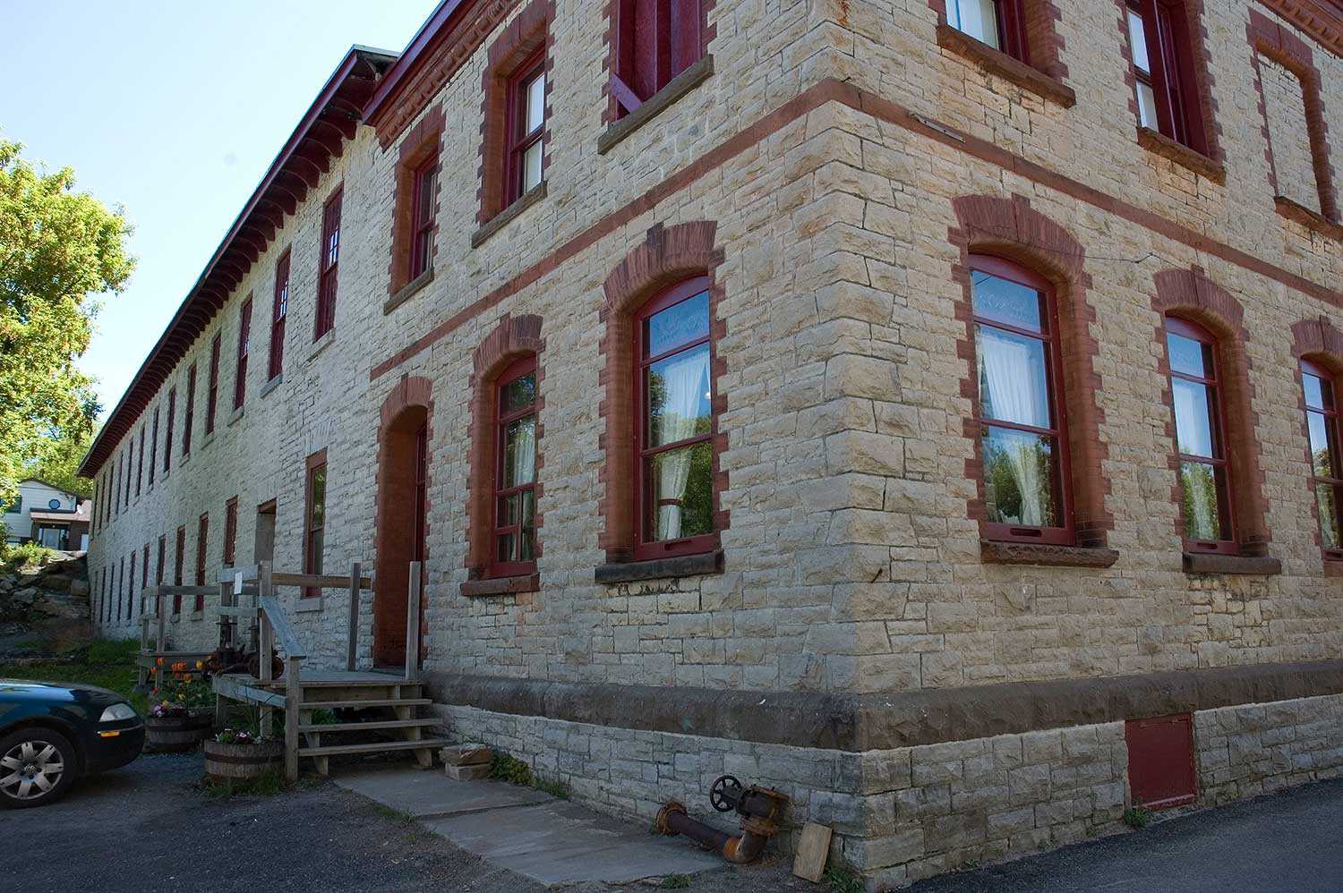
The big oak door of the Mississippi Valley Textile Museum in Almonte in eastern Ontario swings silently open as it has done for over 10...

- 12 Feb 2009
- Buildings and architecture
Community - Author: Wayne Kelly and Kathryn McLeod,
Ontario's eastern treasures
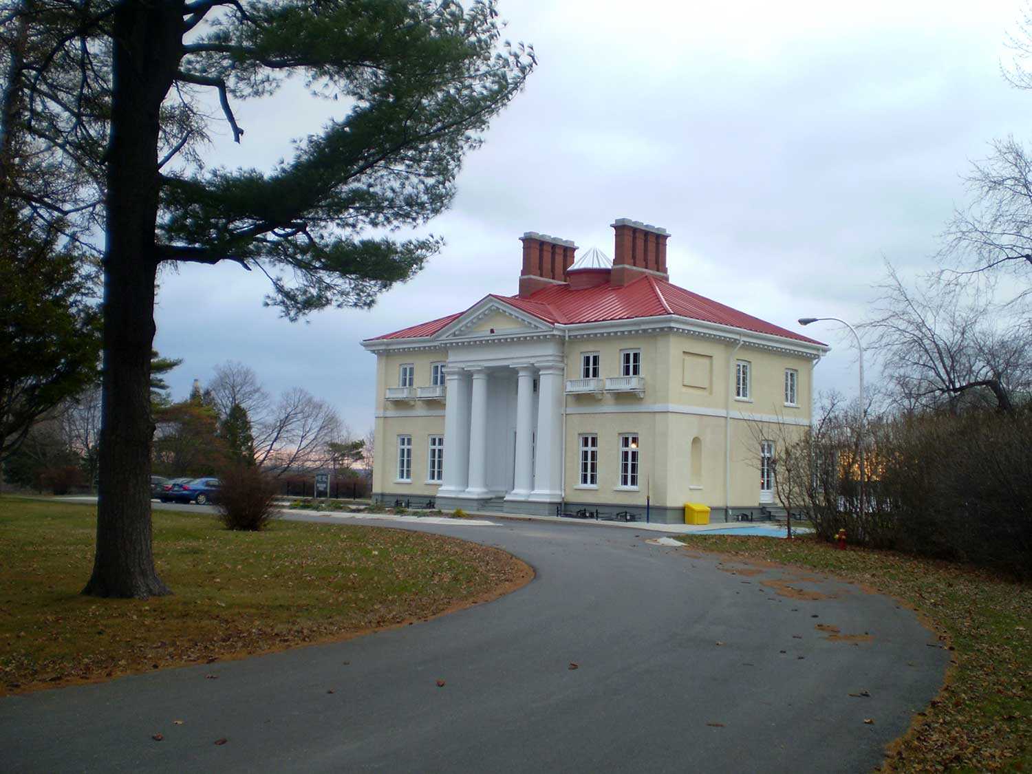
Inhabited by Aboriginal Peoples for 7,000 years, present-day eastern Ontario is rich with heritage. The area gradually transformed as French and later United Empire Loyalists...
- 12 Feb 2009
- Buildings and architecture
- Author: Ellen Kowalchuk,
The Rockwood story
Behind the stately façade of Kingston’s Rockwood Villa lies the history of mental health services in Ontario. Built in 1842 as a residence for local...

- 11 Sep 2008
- Buildings and architecture
Adaptive reuse - Author: Romas Bubelis,
The character of adaptive reuse
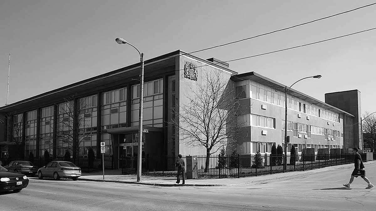
In his 1947 essay titled “The Past in the Future,” architectural historian John Summerson (1904-92) offered this description of an old building. He was speaking...
- 11 Sep 2008
- Buildings and architecture
Community
Adaptive reuse - Author: Erik R. Hanson,
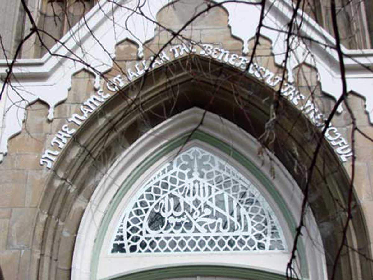
Second chances for Peterborough’s priceless heritage
One of the greatest challenges to creating a healthy downtown is getting people to live there. While Peterborough’s historic centre is full of beautiful heritage...
- 11 Sep 2008
- Buildings and architecture
- Author: Sean Fraser,
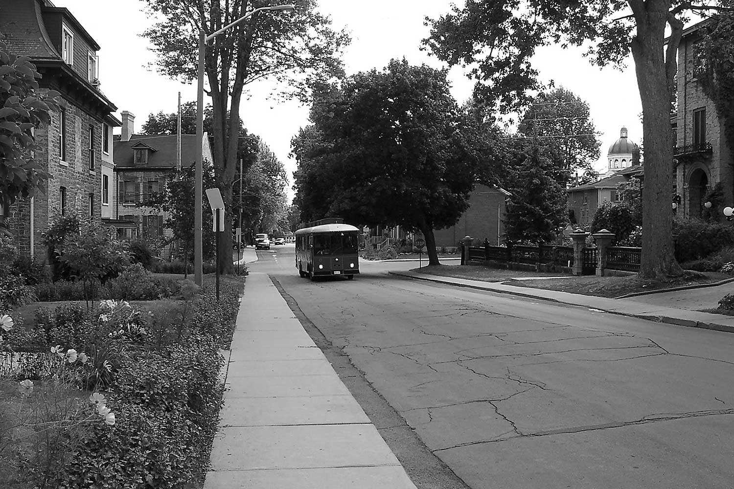
The heritage of faith – Ontario’s places of worship
In 2006, the Ontario Heritage Trust began compiling an inventory of significant pre-1982 purpose-built places of worship located throughout the province. These remarkable cultural treasures...
- 11 Sep 2008
- Buildings and architecture
Community - Author: Marcus R. Létourneau,
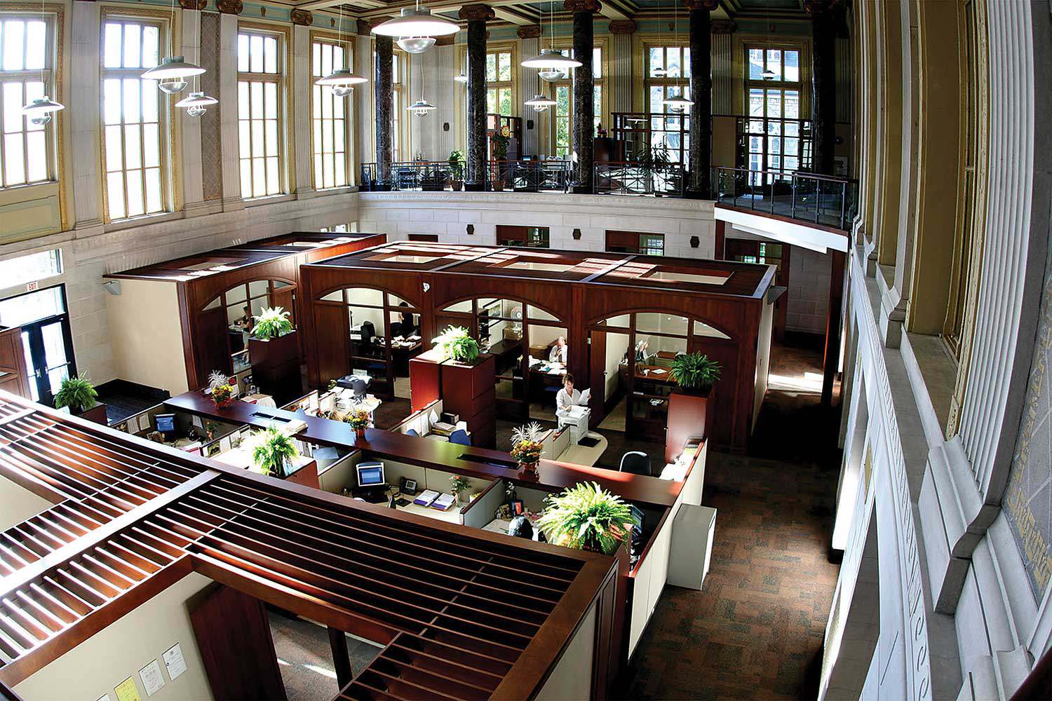
Kingston’s heritage: Time and again
The City of Kingston sits at a strategic location, halfway between Montreal and Toronto, where Lake Ontario meets the western end of the St. Lawrence...

- 11 Sep 2008
- Buildings and architecture
- Author: Beth Anne Mendes and Erin Semande,
Alma College remembered
By mid-afternoon on Wednesday, May 28, 2008, Alma College in St. Thomas was reduced to a smouldering ruin. The loss of this significant site to...
- 11 Sep 2008
- Buildings and architecture
Adaptive reuse - Author: Sean Fraser,
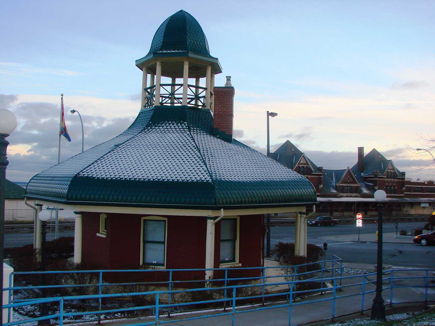
Understanding adaptive reuse
In our efforts to conserve heritage properties, finding a use can be our greatest challenge and our greatest opportunity. An unused, vacant heritage building is...
- 12 Jun 2008
- Buildings and architecture
Community - Author: Thomas Wicks,
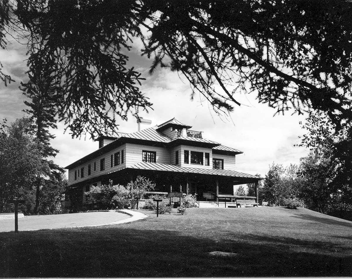
A renaissance of northern heritage
After railway development connected this once-isolated area to the rest of the province at the end of the 19th century, the abundant natural resources attracted...
- 12 Jun 2008
- Buildings and architecture
Community - Author: Denis Héroux,
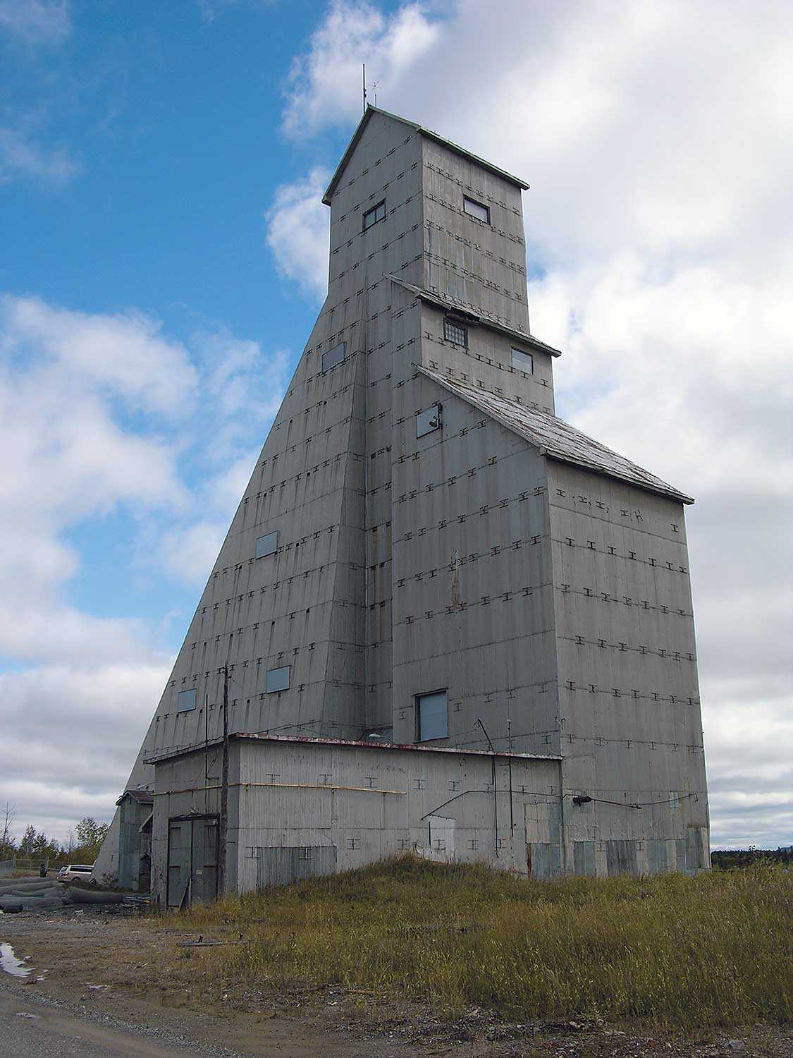
Adventurous workers wanted for remote locations – Housing provided
The exploration, settlement and development of northern Ontario were motivated by the exploitation of the region’s natural resources – primarily fur, timber, gold and silver...
- 12 Jun 2008
- Buildings and architecture
Community - Author: Romas Bubelis,
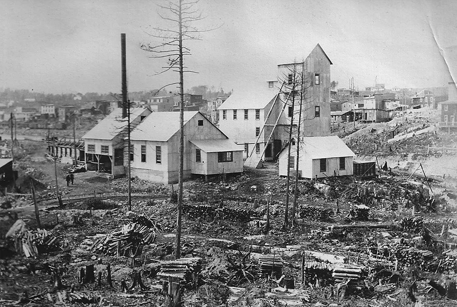
Northern icons
The towering McIntyre Mine Headframe in Timmins. The Clergue Block House and Powder Magazine in Sault Ste Marie. St. Francis of Assisi Anglican Church in...
- 12 Jun 2008
- Buildings and architecture
Community
Cultural landscapes - Author: Sean Fraser,
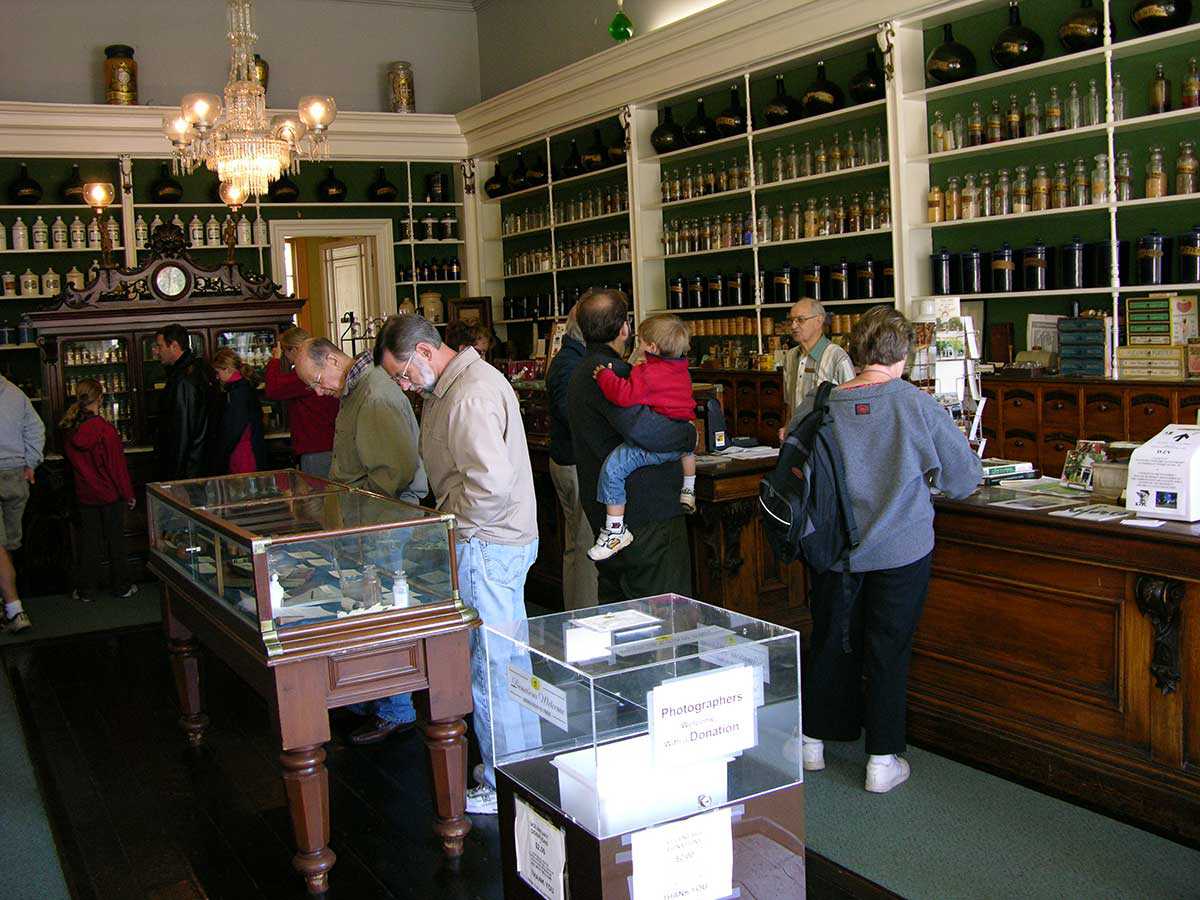
The historical Cobalt Mining District – A community resource
At the turn of the 20th century, Cobalt was a small and isolated lumber camp. In August 1903, two lumbermen – James McKinley and Ernest...
- 14 Feb 2008
- Buildings and architecture
Cultural objects - Author: Kathryn Dixon,
Friends of the Trust
Throughout its 40 years, the Ontario Heritage Trust has developed strong partnerships with local communities. Among these partnerships are those with the groups whose efforts...
- 14 Feb 2008
- Buildings and architecture
Arts and creativity
Adaptive reuse - Author: Gordon Pim,
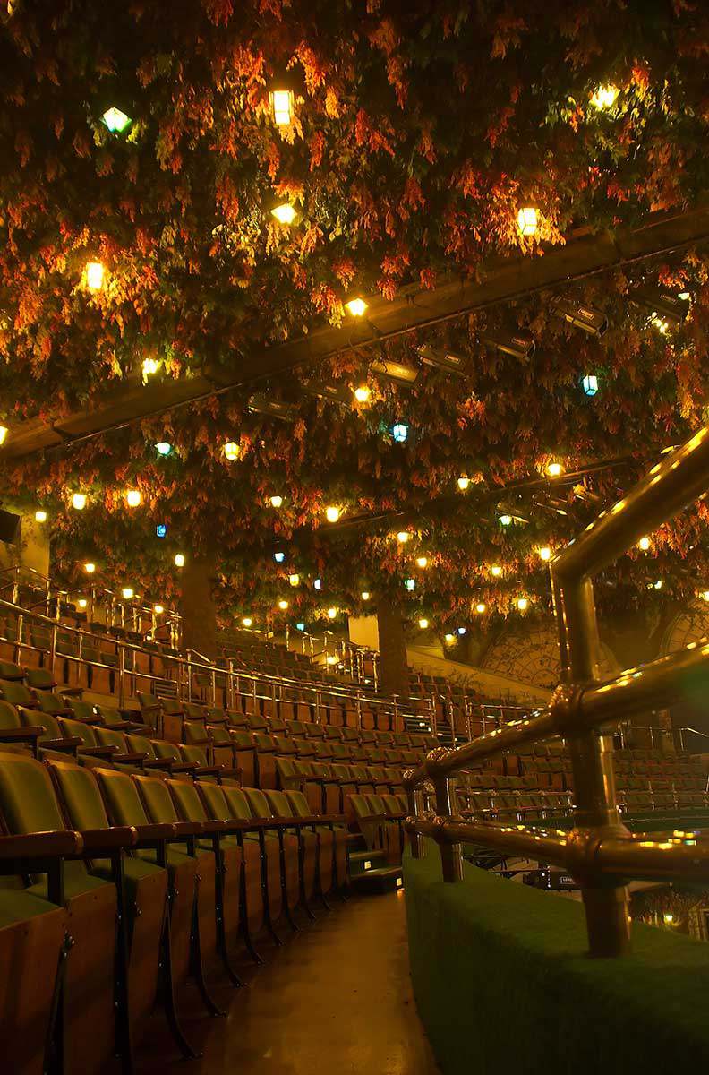
Raising the curtain: How the Winter Garden Theatre was rediscovered
In December 1913, Loew’s Yonge Street Theatre – the Canadian flagship of the mighty Loew’s empire – opened in Toronto. Two months later, the opulent...
- 14 Feb 2008
- Buildings and architecture
- Author: Sean Fraser,
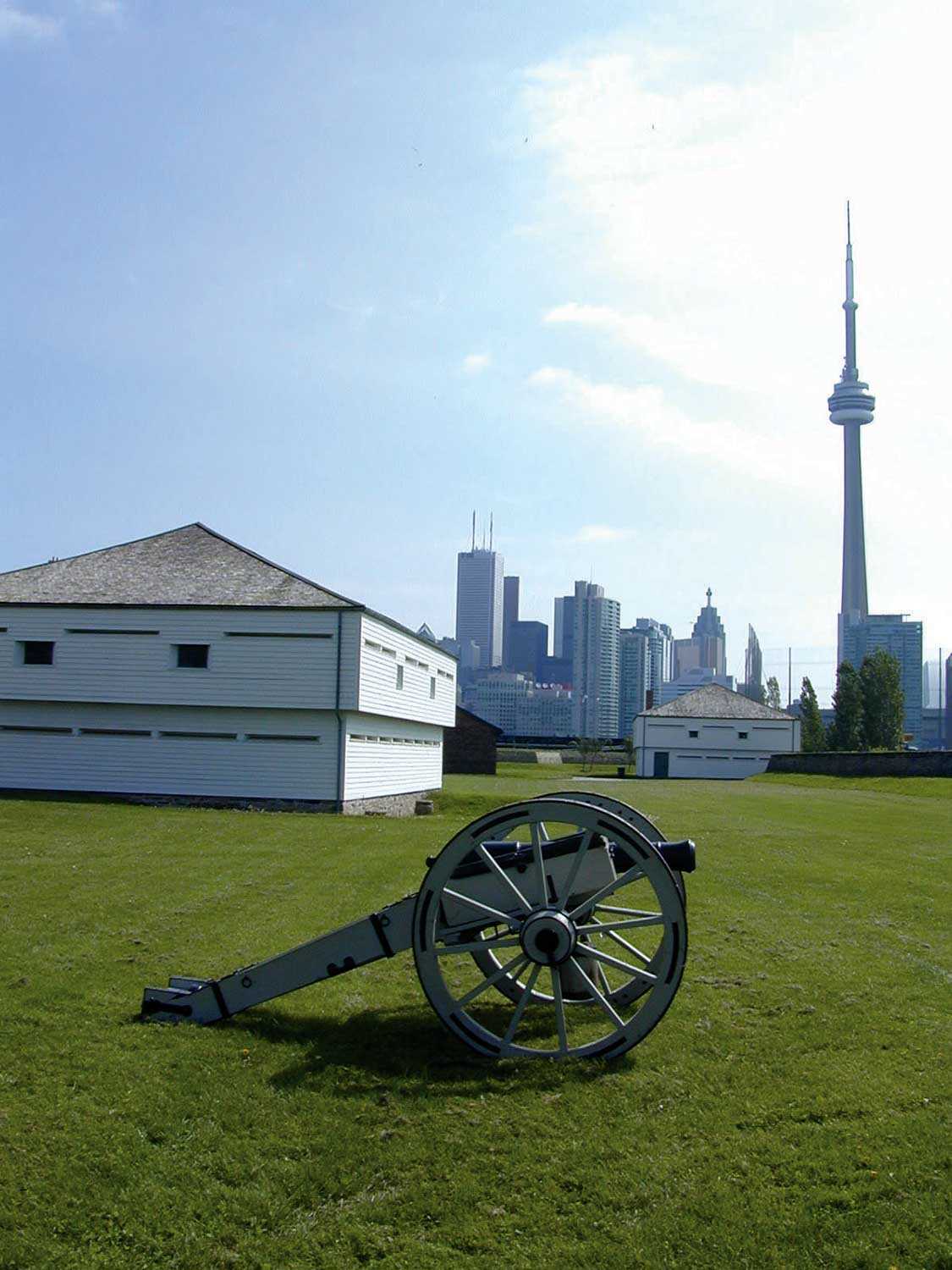
The past empowered
The buildings, structures and landscapes that comprise our cultural heritage are products of the intricate interplay between people and place over time. What is preserved...
- 14 Feb 2008
- Buildings and architecture
- Author: Sean Fraser,
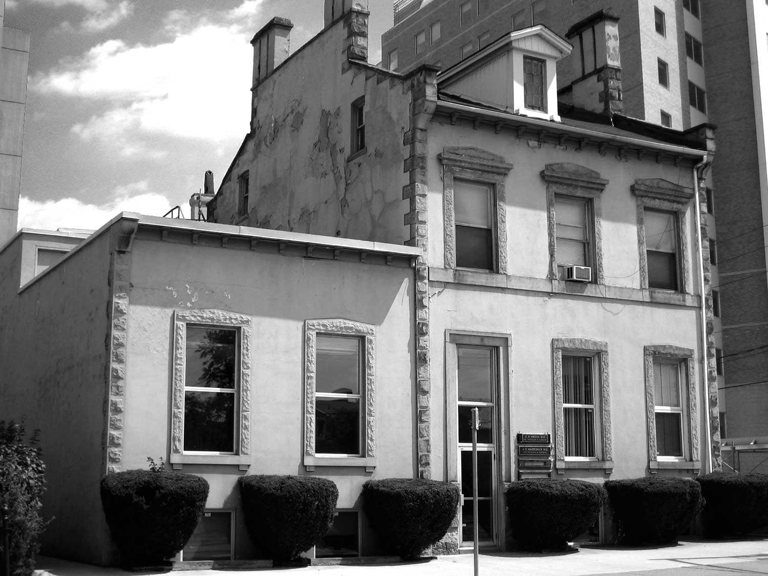
Have you seen this building?
In November 2007, the Sir Aemilius Irving House in Hamilton was demolished by its owner to make way for a new building. Unfortunately, local heritage...
- 14 Feb 2008
- Buildings and architecture
- Author: Beth Hanna,
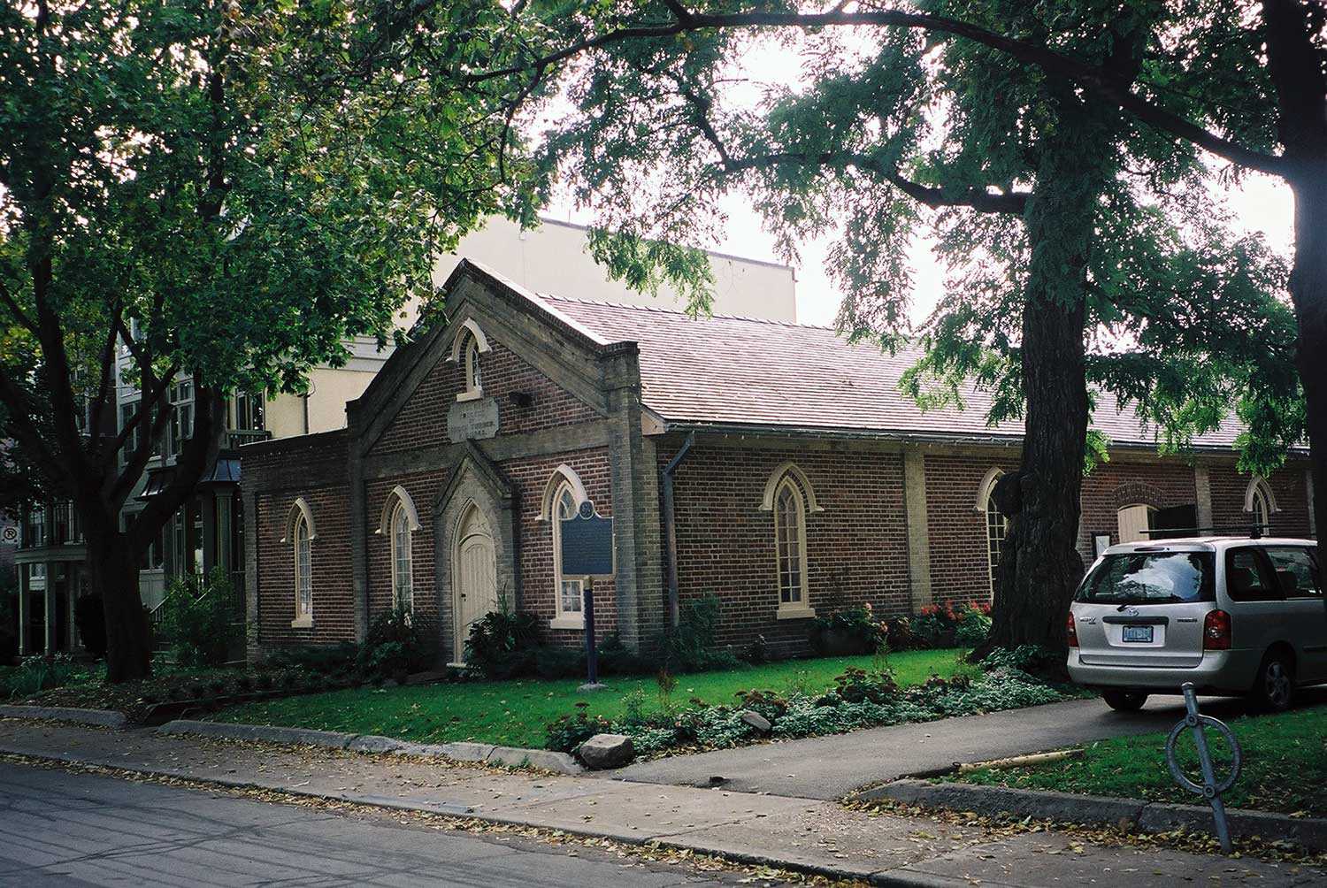
Enoch Turner Schoolhouse – a citizen’s legacy
When the province of Ontario introduced the 1847 Common Schools Act, municipalities were given the power to introduce taxes to fund public education. Toronto city...
- 14 Feb 2008
- Buildings and architecture
- Author: Laura Hatcher,
Counting our blessings
Built in Glengarry in 1821, St. Raphael’s Church was one of Ontario’s earliest Roman Catholic churches. Constructed under the supervision of Alexander Macdonell – Upper...
- 15 Nov 2007
- Buildings and architecture
Environment - Author: Romas Bubelis,
Building assets
Which is more sustainable – an artificial or live Christmas tree? This is an environmentalist’s conundrum, and it illustrates the paradox of “sustainable” building materials...
- 15 Nov 2007
- Buildings and architecture
Environment
Adaptive reuse - Author: Sean Fraser,
The guiding principles of sustainable architecture
In the late 1990s, the Ontario Ministry of Culture introduced Eight Guiding Principles in the Conservation of Built Heritage Properties, which are in common use...
- 15 Nov 2007
- Buildings and architecture
Environment - Author: Sean Fraser and Karen Abel,
Inside Sheppard’s Bush
Charles Sheppard (1876-1967) moved to the Town of Aurora in 1921, after making his fortune in the Simcoe County lumber industry. Brooklands, his modest estate...

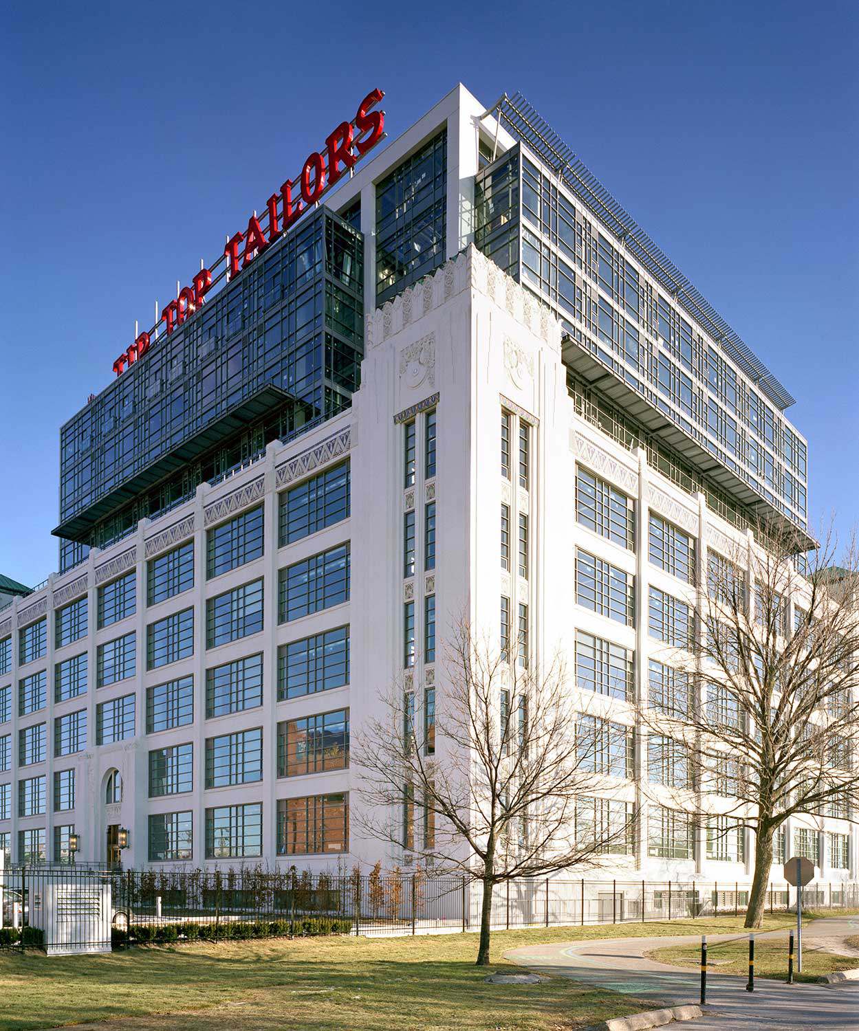
Evergreen Brick Works: Rethinking space
Evergreen – a national charity – builds the relationship between nature, culture and community in urban spaces. With its revitalization of Toronto’s Don Valley Brick...
- 15 Nov 2007
- Buildings and architecture
Community - Author: Beth Anne Mendes,
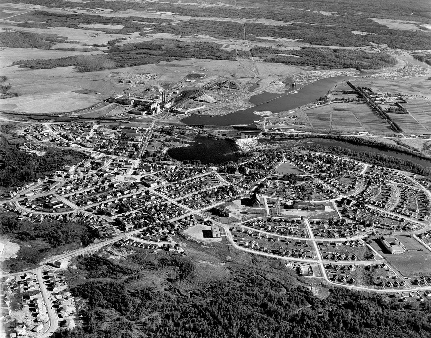
Discovering the City Beautiful
On July 25, 2007, the Ontario Heritage Trust and the Town of Kapuskasing unveiled a provincial plaque to commemorate the town plan that helped shape...

- 15 Nov 2007
- Buildings and architecture
Environment - Author: Sean Fraser,
Fact or fiction: Demystifying the myths around going green – Moving toward a more sustainable architecture
Sustainable: able to be maintained at a certain rate or level . . . conserving an ecological balance by avoiding a depletion of natural resources...
- 15 Nov 2007
- Buildings and architecture
Environment
Adaptive reuse - Author: Alex Speigel,
Sustainability for old buildings: A developer’s perspective
Adaptive reuse provides a sound and sustainable approach to the renewal of our urban fabric, as illustrated by the conversion of three Toronto buildings to...

- 10 May 2007
- Buildings and architecture
- Author: Sean Fraser,
Building on our successes
The Ontario Heritage Trust’s heritage conservation easements conserve some of Ontario’s most significant heritage sites. Good stewardship of easement properties includes regular maintenance and periodic...
- 10 May 2007
- Buildings and architecture
Adaptive reuse - Author: Kathryn Dixon,
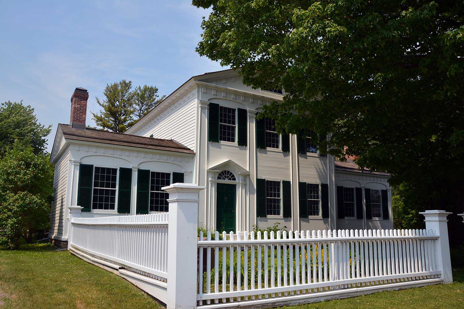
The story of Barnum House
Barnum House, on the north side of Highway 2 (Danforth Road), west of Grafton is historically significant for its association with the Barnum family. It...

- 10 May 2007
- Buildings and architecture
Community
Tools for conservation - Author: Beth Hanna,
The R’s of conservation
An earlier generation spoke of the three R’s as “Reading, ‘riting and ‘rithmetic.” They were the fundamentals of education in the 19th century and considered...

- 10 May 2007
- Military heritage
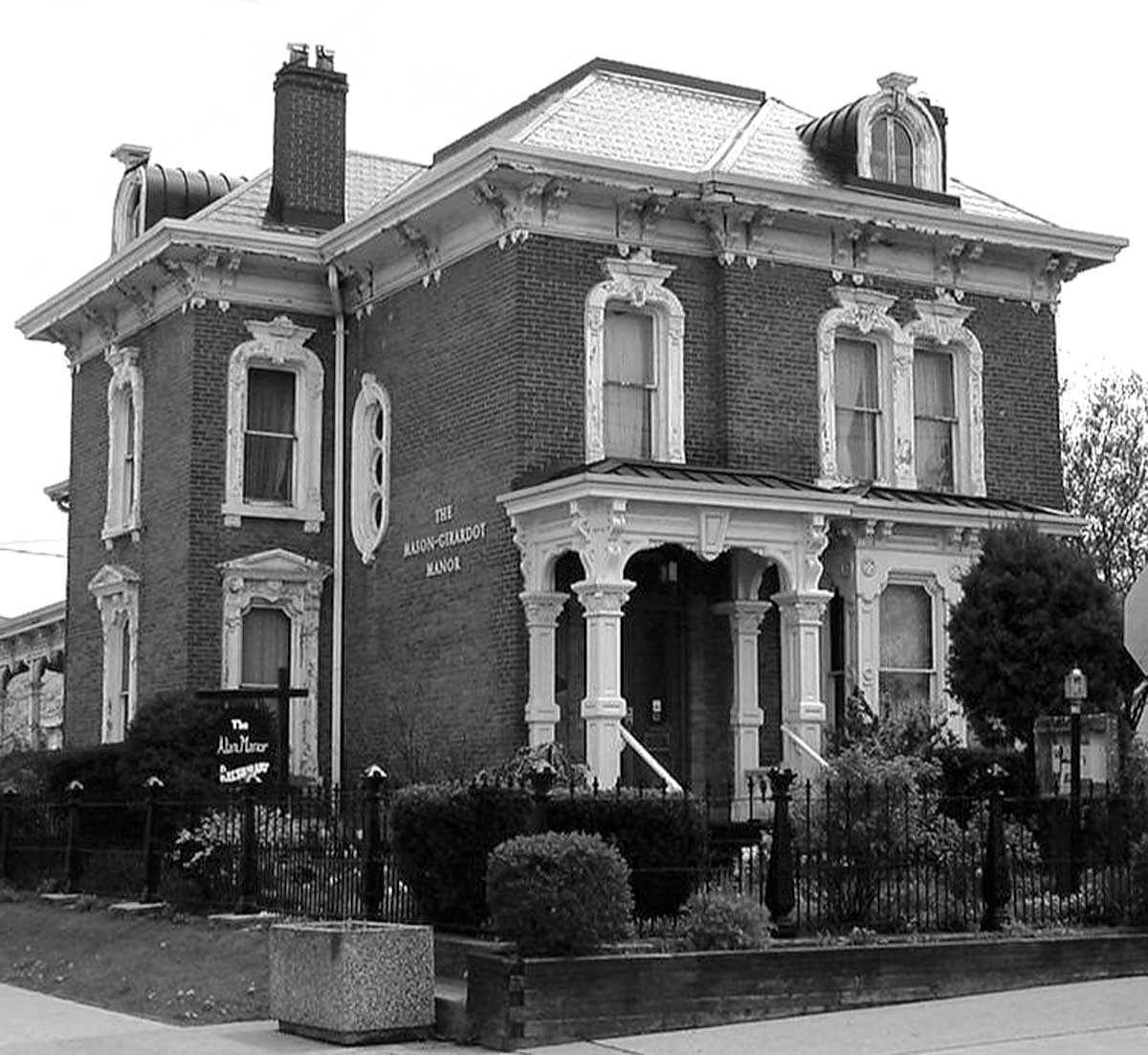
Buildings and architecture - Author: Susan Ramsay and Marnie Maslin,
Battlefield House Museum and Park – A pioneer in the history of preservation
Nestled under the Niagara Escarpment and situated in a park connected to the Bruce Trail, Battlefield House Museum National Historic Site in Stoney Creek is...
- 10 May 2007
- Buildings and architecture
Community
Tools for conservation - Author: Sean Fraser,
Leading the way in municipal heritage planning
What’s happening in your community? With significant amendments to the Ontario Heritage Act in April 2005 and a strengthening of the Provincial Policy Statement (PPS)...
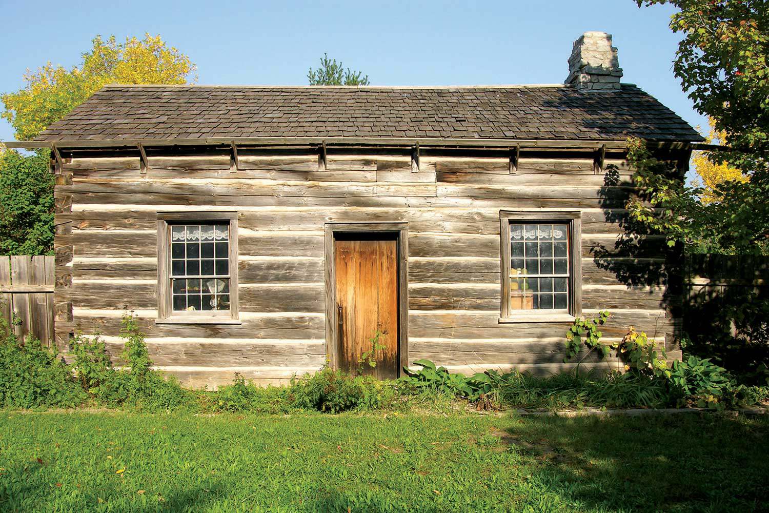
- 15 Feb 2007
- Buildings and architecture
Community - Author: Kiki Aravopoulos,
Exploring Country Heritage Park
In March 2006, the Ontario Heritage Trust acquired a cultural conservation easement on Country Heritage Park. Located in Milton, this designed heritage attraction was created...

- 15 Feb 2007
- Buildings and architecture
Cultural objects
Tools for conservation - Author: Romas Bubelis and Nick Holman,
Heritage conservation at our front door
The term “porte-cochère” has continental flair, though humble origins. In French, it means “carriage door” and originally referred to a covered entryway into a courtyard...
- 15 Feb 2007
- Black heritage
Buildings and architecture
Natural heritage - Author: Gordon Pim,
Heritage by numbers
Ontario’s heritage is an immense and complex jigsaw puzzle. Every individual element of heritage creates a whole . . . a sort of heritage by...
- 07 Sep 2006
- Buildings and architecture
Community - Author: Louise Burchell,
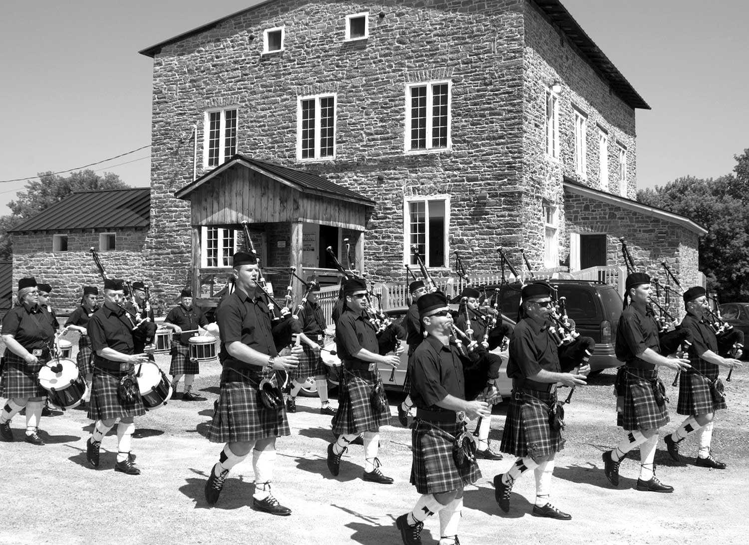
Saving the Spencerville Mill – Preserving community heritage
The Spencerville Mill, a fine cut-stone flour and grist mill, is located on the bank of the South Nation River in the small rural village...

- 07 Sep 2006
- Buildings and architecture
Community
Cultural objects - Author: Erin Semande,
The biography of a house: If these walls could speak
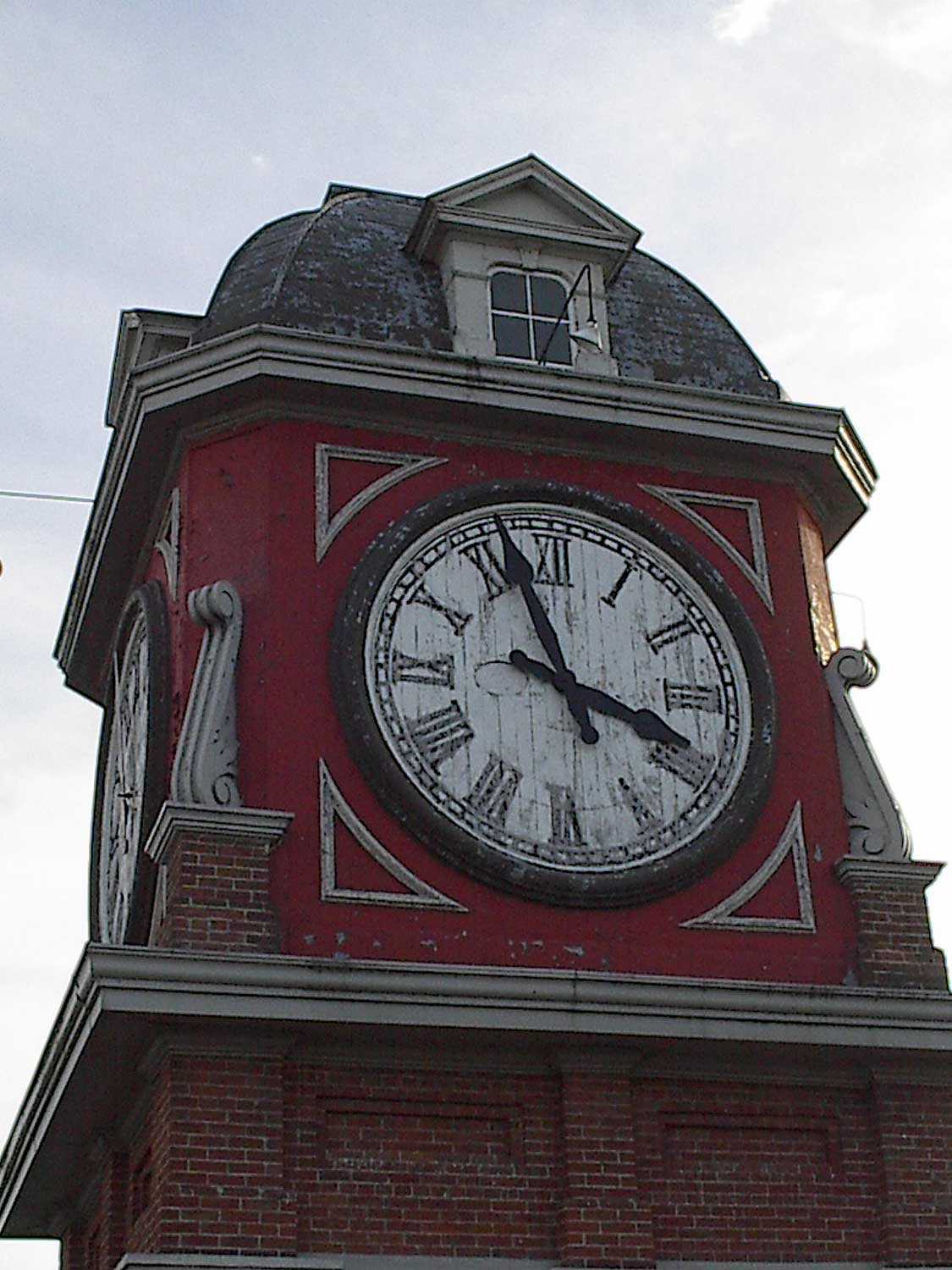
Researching family history is a popular pastime for many who want to uncover their family’s unique past and discover how they contributed to Ontario’s growth...
- 16 Feb 2006
- Buildings and architecture
Community
Tools for conservation - Author: Gordon Pim,
Winning the battle
There are countless examples across the province of successful restorations of Ontario’s treasured heritage sites. Although the challenges are great – funding being the primary...

- 16 Feb 2006
- Buildings and architecture
Community
Adaptive reuse - Author: Sean Fraser,
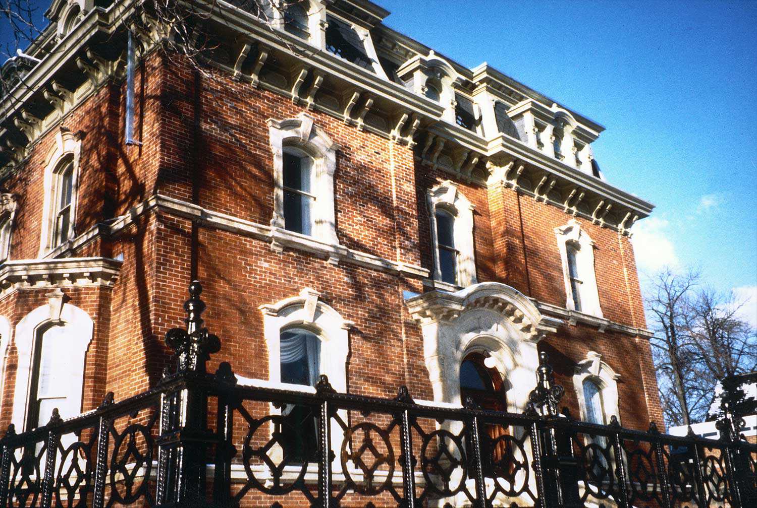
Our cultural heritage places: how heritage buildings adapt
Although heritage remains a year-round activity for many of us, Heritage Day is celebrated annually on the third Monday in February. This year’s theme speaks...
- 16 Feb 2006
- Buildings and architecture
- Author: Gordon Pim,
Snapshots of the past
A flash of phosphorus. A whiff of smoke. And an image is captured. Photographs have chronicled our lives for over 150 years, remaining one of...

- 16 Feb 2006
- Archaeology
Buildings and architecture
Cultural objects
Tools for conservation - Author: Romas Bubelis,
Historic wallpaper: Finding what’s beneath
Wallpapers first appeared in Canada as early as the mid-17th century. These oldest papers were block-printed, hand-painted or stenciled. Pattern and colour was applied to...
- 16 Feb 2006
- Buildings and architecture
Community - Author: Tim Mallon,
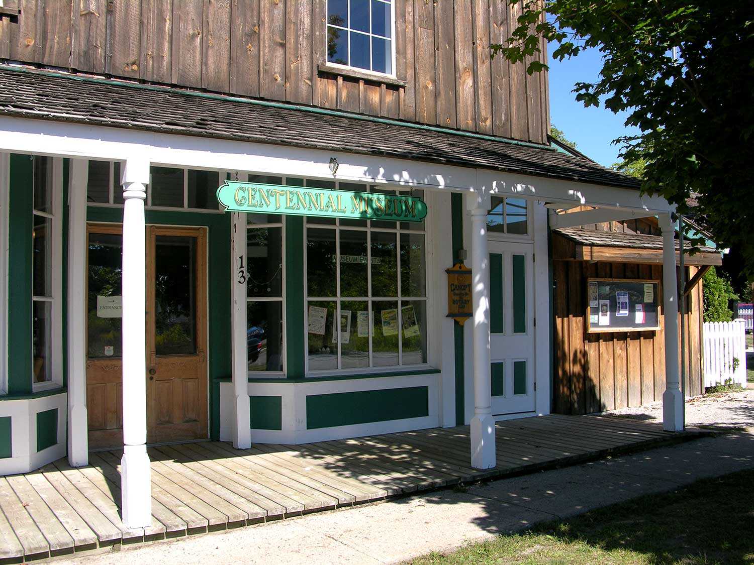
Small-town museums key to small-town success
For 18 years, my wife and I raised our two sons in the Town of Richmond Hill just north of Toronto. When we moved to...

- 16 Feb 2006
- Archaeology
Buildings and architecture - Author: Ontario Heritage Trust,
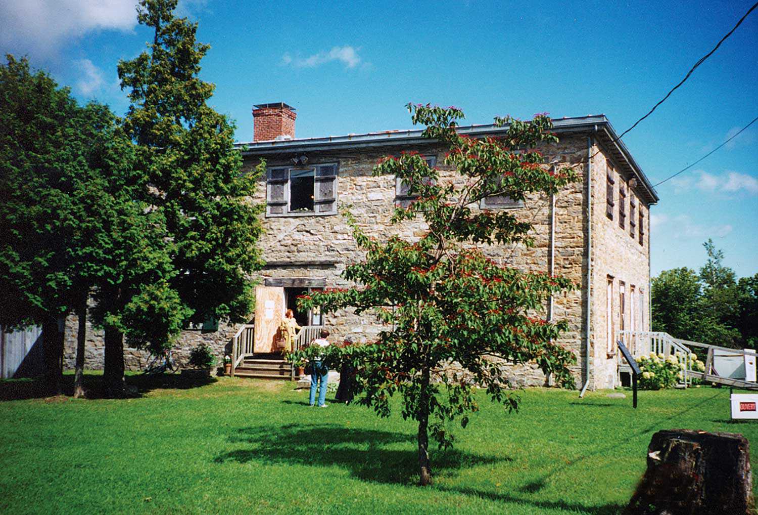
Breaking news: Saving our First Parliament
It was announced on December 21, 2005 that the site of Ontario’s first parliament buildings in Toronto has been saved. The Ontario Government, in partnership...
- 08 Sep 2005
- Archaeology
Buildings and architecture - Author: Dena Doroszenko,
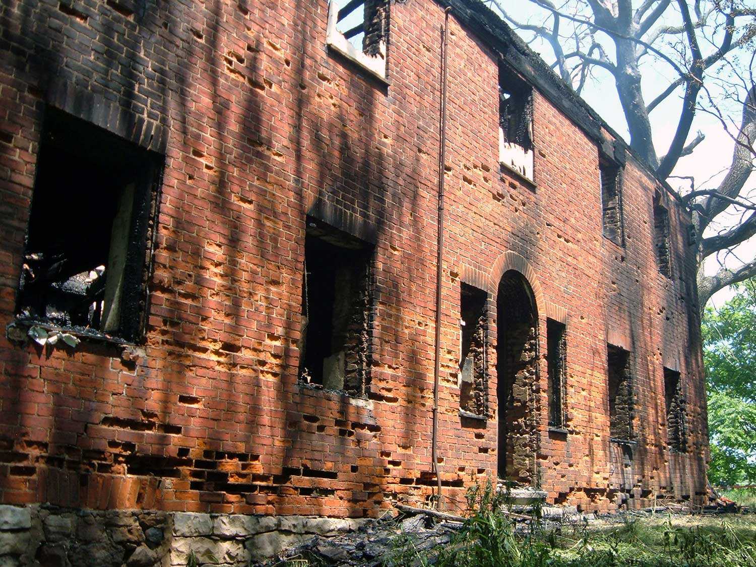
Unearthing the past: Discoveries at Macdonell-Williamson House
Built in 1817, Macdonell-Williamson House in eastern Ontario reflects the ambitions and aspirations of retired fur trader, John Macdonell. His life was fraught with financial...
- 08 Sep 2005
- Buildings and architecture
Community - Author: David Cuming,
Moving forward with heritage conservation
Thirty years ago, when the Ontario Heritage Act was new, I was a young planner with about a year’s experience working in London, England and...
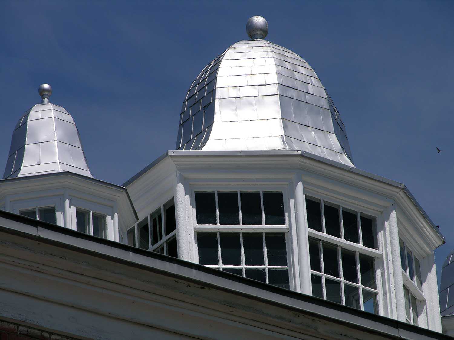
- 08 Sep 2005
- Buildings and architecture
Tools for conservation - Author: Ontario Heritage Trust,
The healthy roof: Staying on top of heritage preservation
The following excerpt appears in Well-Preserved: The Ontario Heritage Foundationʼs Manual of Principles and Practice for Architectural Conservation (Third Revised Edition), by Mark Fram (Boston...

- 08 Sep 2005
- Buildings and architecture
Tools for conservation - Author: Barbara Heidenreich and Jeremy Collins,
New natural heritage easement properties
John Edward (Ted) Greenwood Sanctuary On March 30, 2005, the Ontario Heritage Foundation received – from Mary Greenwood of Nakara, Australia – a 100-acre (40-...
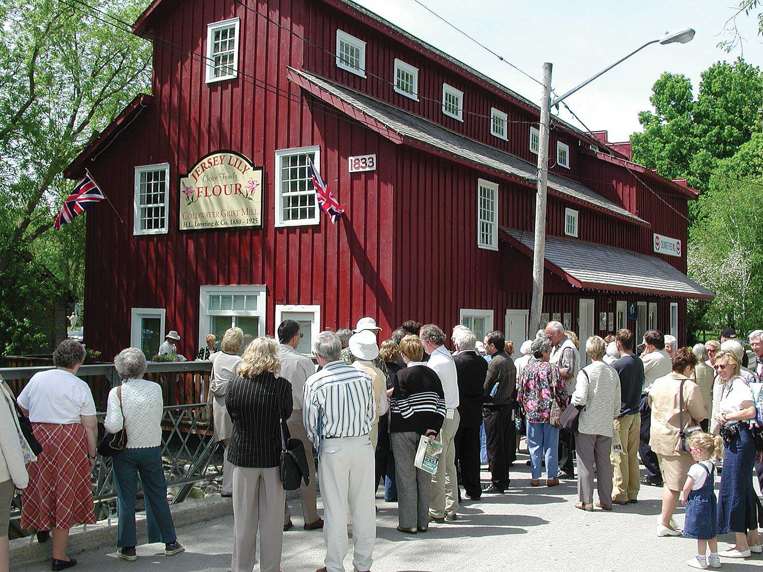
- 08 Sep 2005
- Buildings and architecture
Natural heritage
Community
Cultural landscapes - Author: Richard Moorhouse and Beth Hanna,
The new Ontario Heritage Act: The evolution of heritage conservation
An important shift has occurred in Ontario’s legislative framework for heritage conservation. On April 28, 2005, the Ontario Heritage Amendment Act (Bill 60) received royal...

- 19 May 2005
- Buildings and architecture
- Author: Larry Wayne Richards,
Trent University under the modernist microscope
Throughout the developed world, attention is being given to the built heritage of the modern era. Organizations such as UNESCO's World Heritage Center, the International...
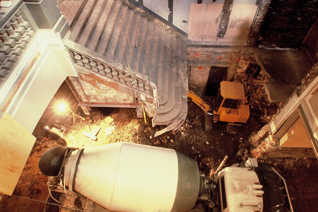
- 19 May 2005
- Buildings and architecture
Tools for conservation - Author: Ontario Heritage Trust,
Working with superstructures: The framework for Ontario's heritage buildings
Last issue, we discussed the importance of a solid foundation when preserving heritage structures. In this issue, we see how a buildingʼs skeleton holds everything...
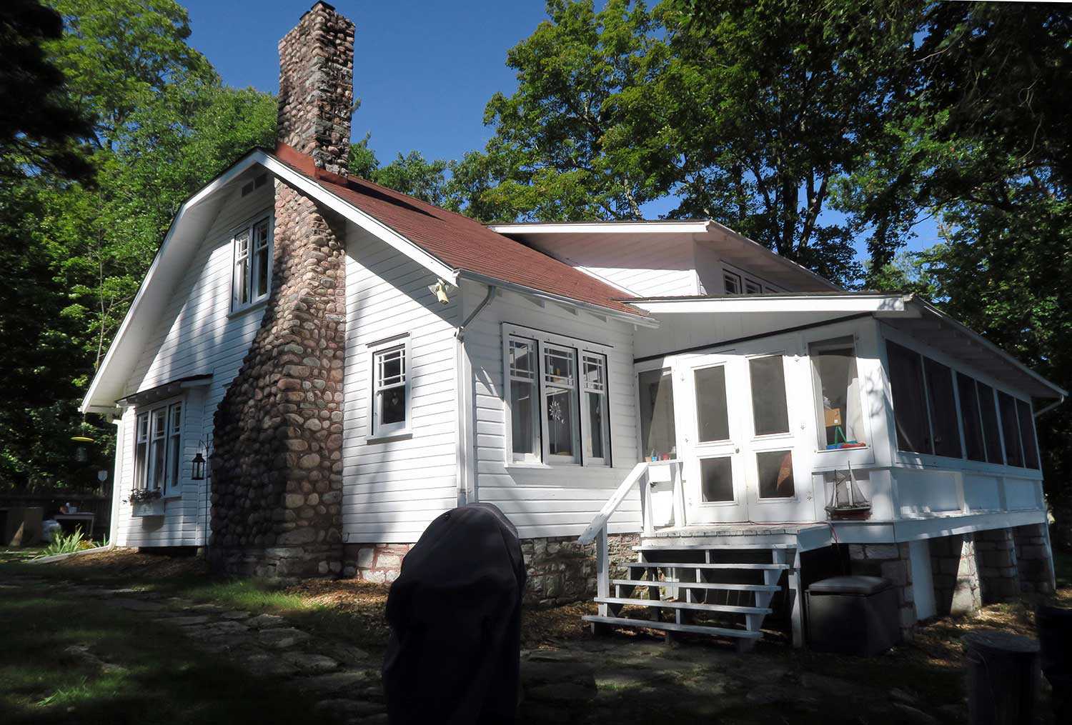
- 19 May 2005
- Buildings and architecture
- Author: Ontario Heritage Trust,
Leidra Lodge – A new conservation easement
June Ardiel has been a patron and leader in Ontario's arts community all her life. She has authored a book on the public art of...
- 19 May 2005
- Buildings and architecture
- Author: Moiz Behar,
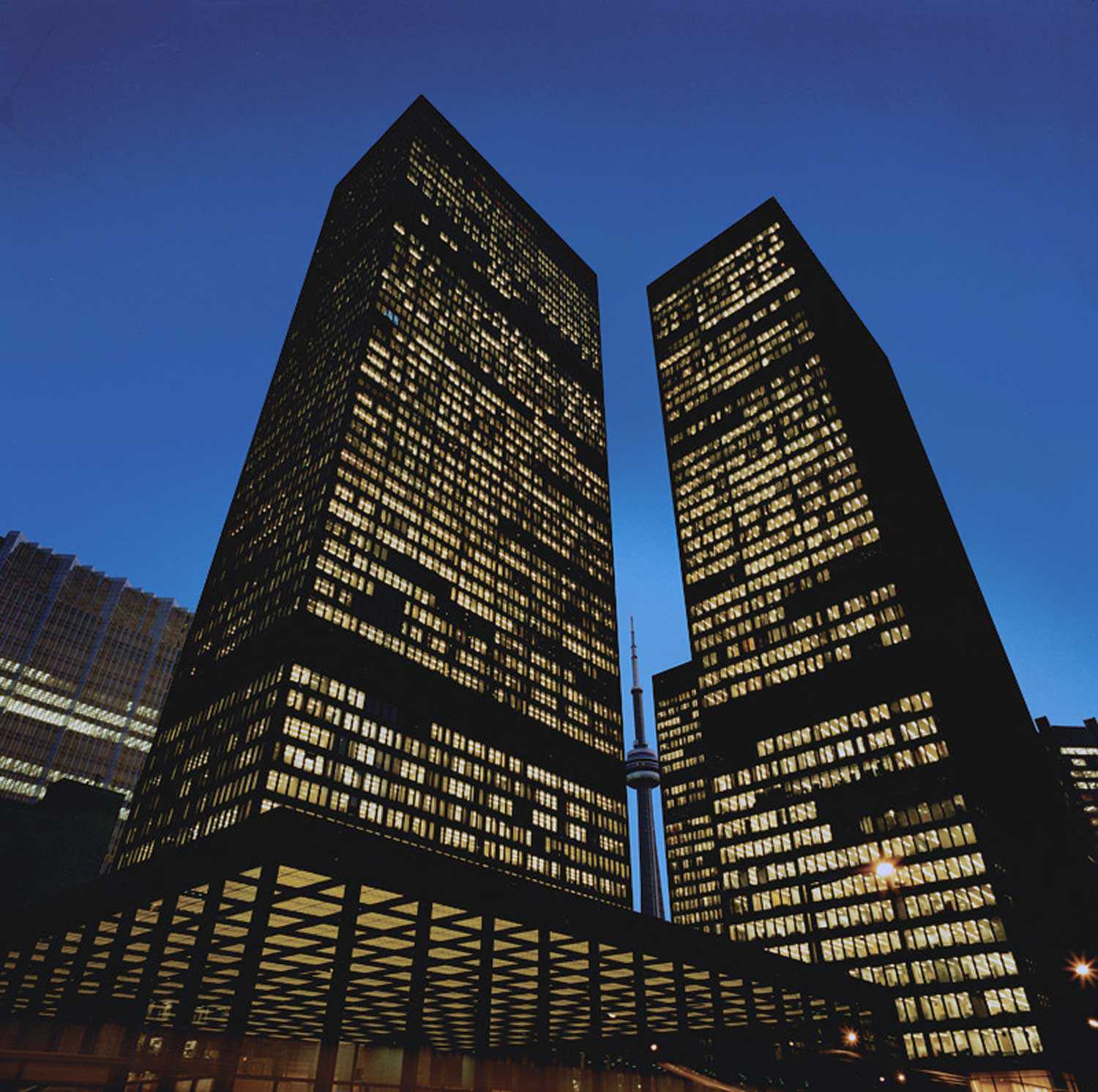
The changing face of heritage: The International Style – Toronto’s Toronto-Dominion Centre
In the second quarter of the 20th century following the First World War, Europe saw the emergence of a significant movement in architecture. This “modern”...

- 19 May 2005
- Buildings and architecture
Cultural objects - Author: Ontario Heritage Trust,
The Homewood collection
As you drive east along Highway 2 between Brockville and Prescott, you will find the robust Georgian Homewood Museum deeply set back from the road...
- 12 Feb 2005
- Black heritage
Buildings and architecture - Author: Wayne Kelly,
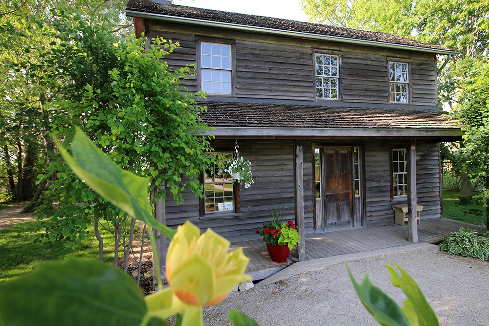
Inside Uncle Tom's Cabin
At a bend in the Sydenham River near the town of Dresden stands Uncle Tom’s Cabin Historic Site. The museum – built on the site...
- 12 Feb 2005
- Buildings and architecture
- Author: Sean Fraser,
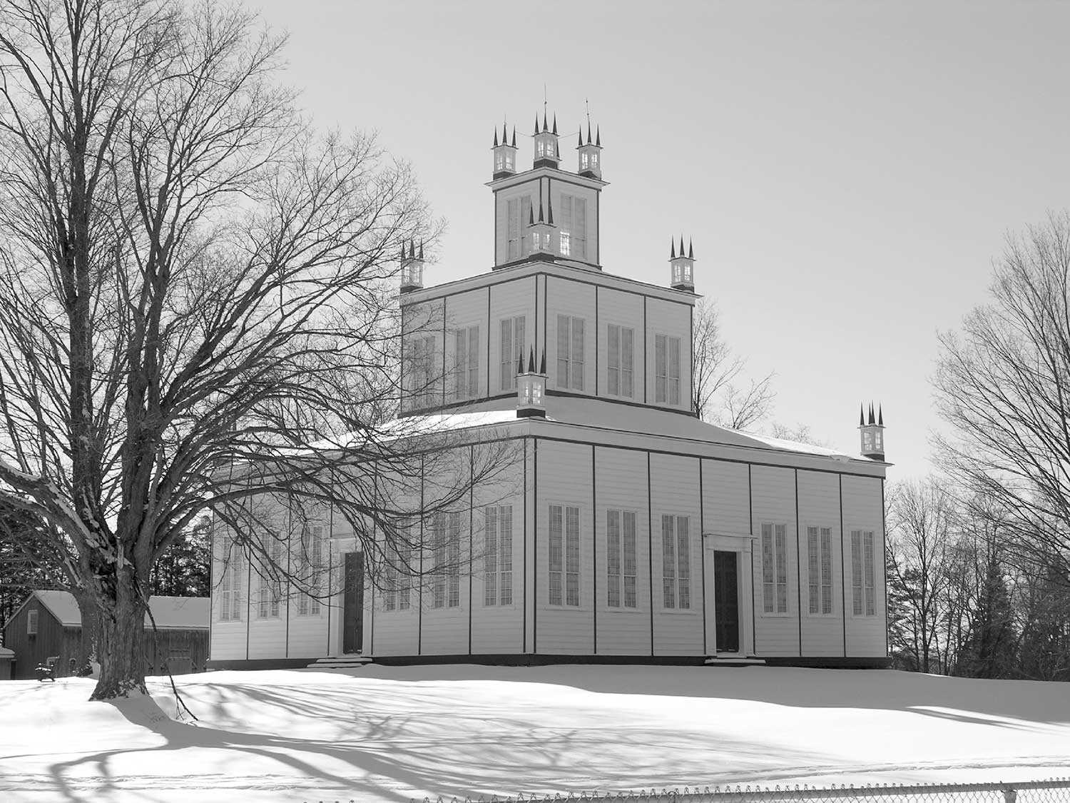
The Sharon Temple and the heritage of faith
While most of Canada celebrates Heritage Day on the third Monday in February, Ontario celebrates Heritage Week. The theme developed for Ontario Heritage Week 200...
- Accessibility
- Privacy statement
- Terms of use
- © King's Printer for Ontario, 2023
- Photos © Ontario Heritage Trust, unless otherwise indicated.

- Accessibility
- Privacy statement
- Terms of use
- © King's Printer for Ontario, 2023
- Photos © Ontario Heritage Trust, unless otherwise indicated.

